

BRIEF
London produces nearly 2 million tonnes of food waste every year, with a cash value of over £2.5 billion. Without realising it, individual households waste £600 worth of
food annually, most of which is still edible. As part of London, Hackney residents and businesses contribute to this staggering figure.
The brief was to create a campaign that encourages both residents and local businesses to recycle more food.
DELIVERABLES
• Logo
• Billboards
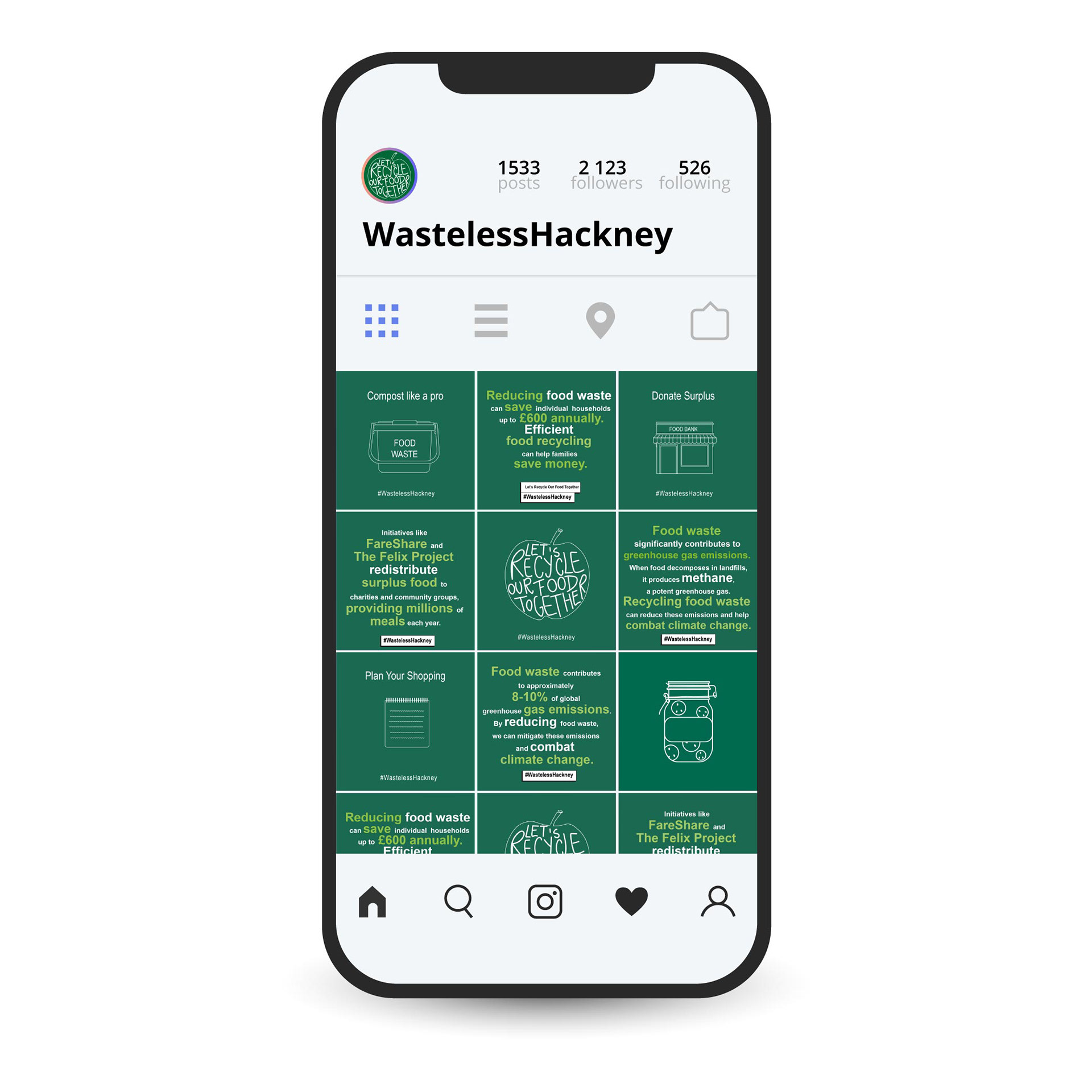
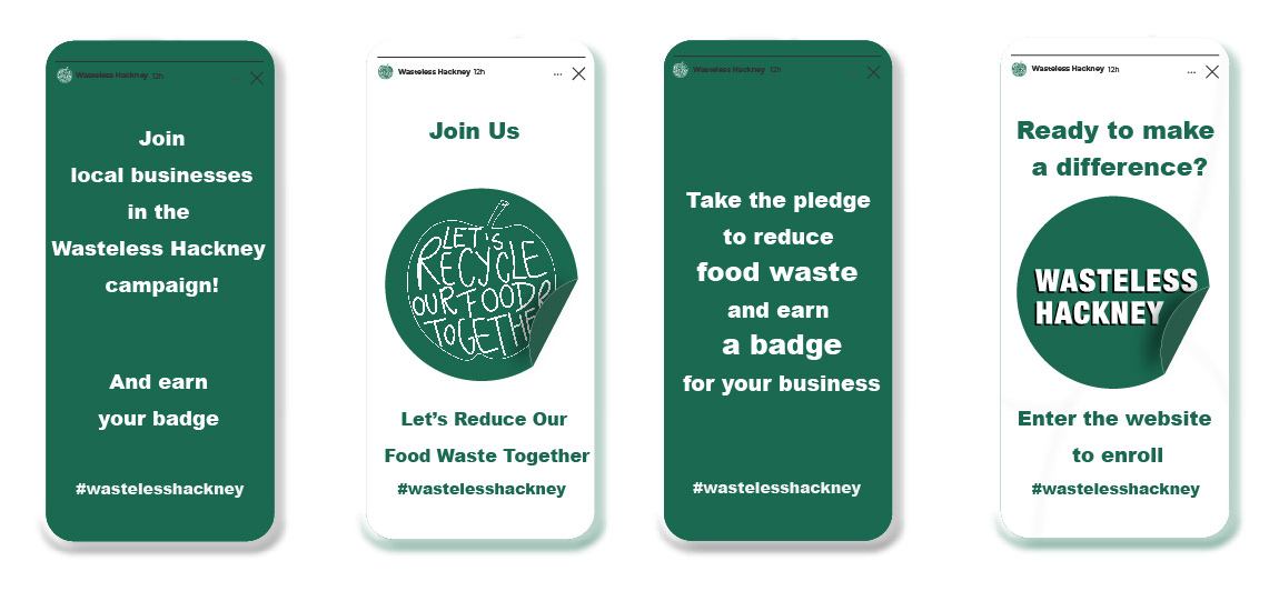
• Social Media
LOGO
I aimed for the name to be memorable, relevant, and to foster a sense of belonging.
‘Wasteless Hackney’ clearly communicates the campaign’s purpose, leaving no room for misunderstanding.
Including ‘Hackney’ in the name helps create a connection with the local community, reinforcing a sense of belonging.


GRAPHIC LANGUAGE
The graphic language for this campaign addresses a serious issue from a more positive perspective, offering both residents and local businesses practical solutions to help tackle food waste.
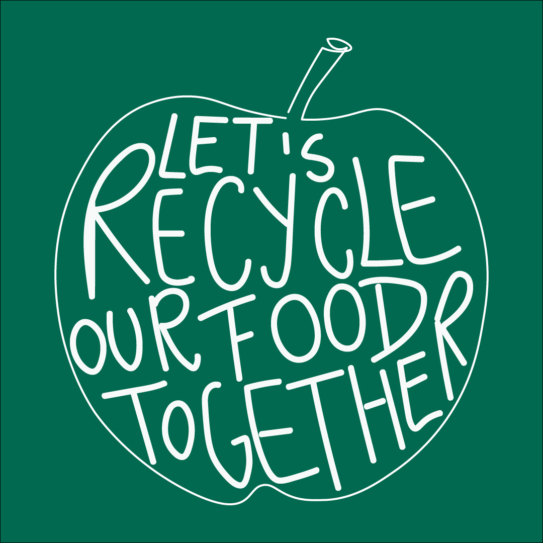
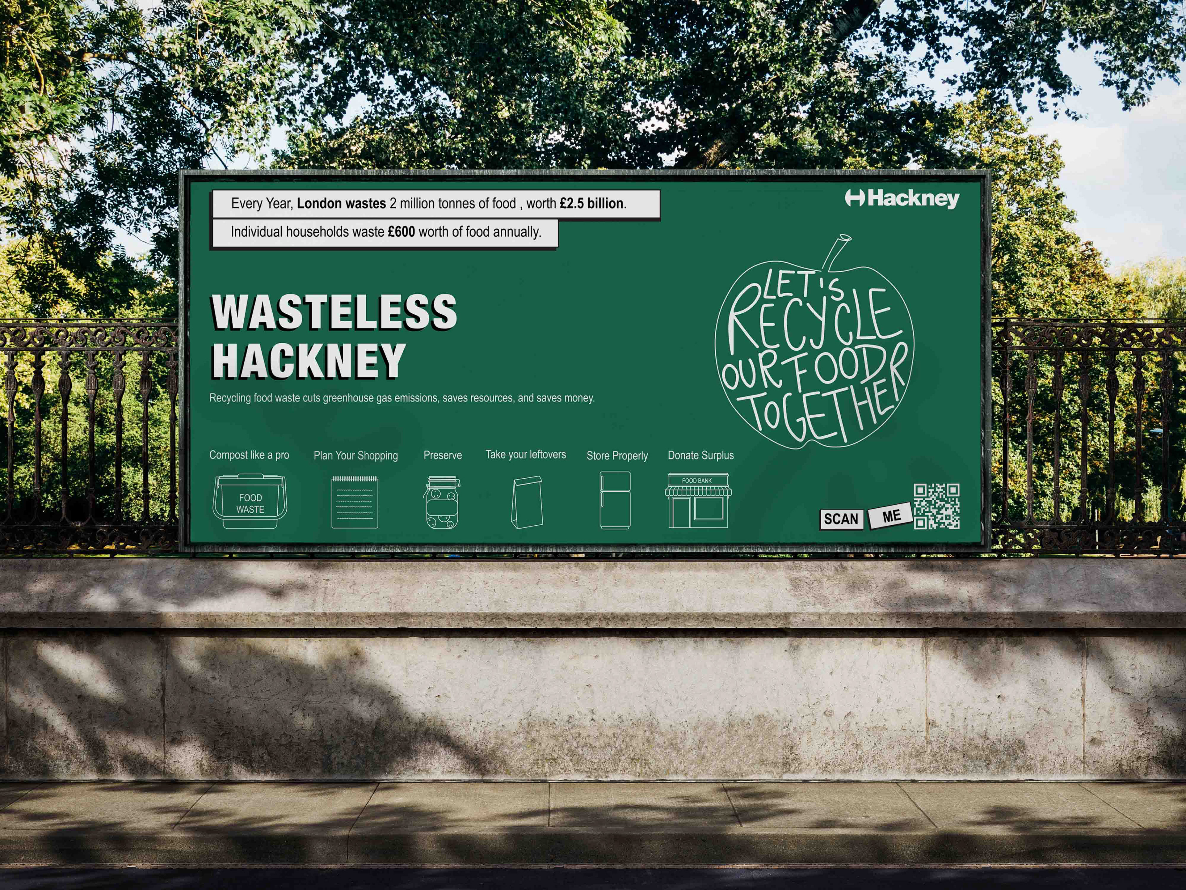
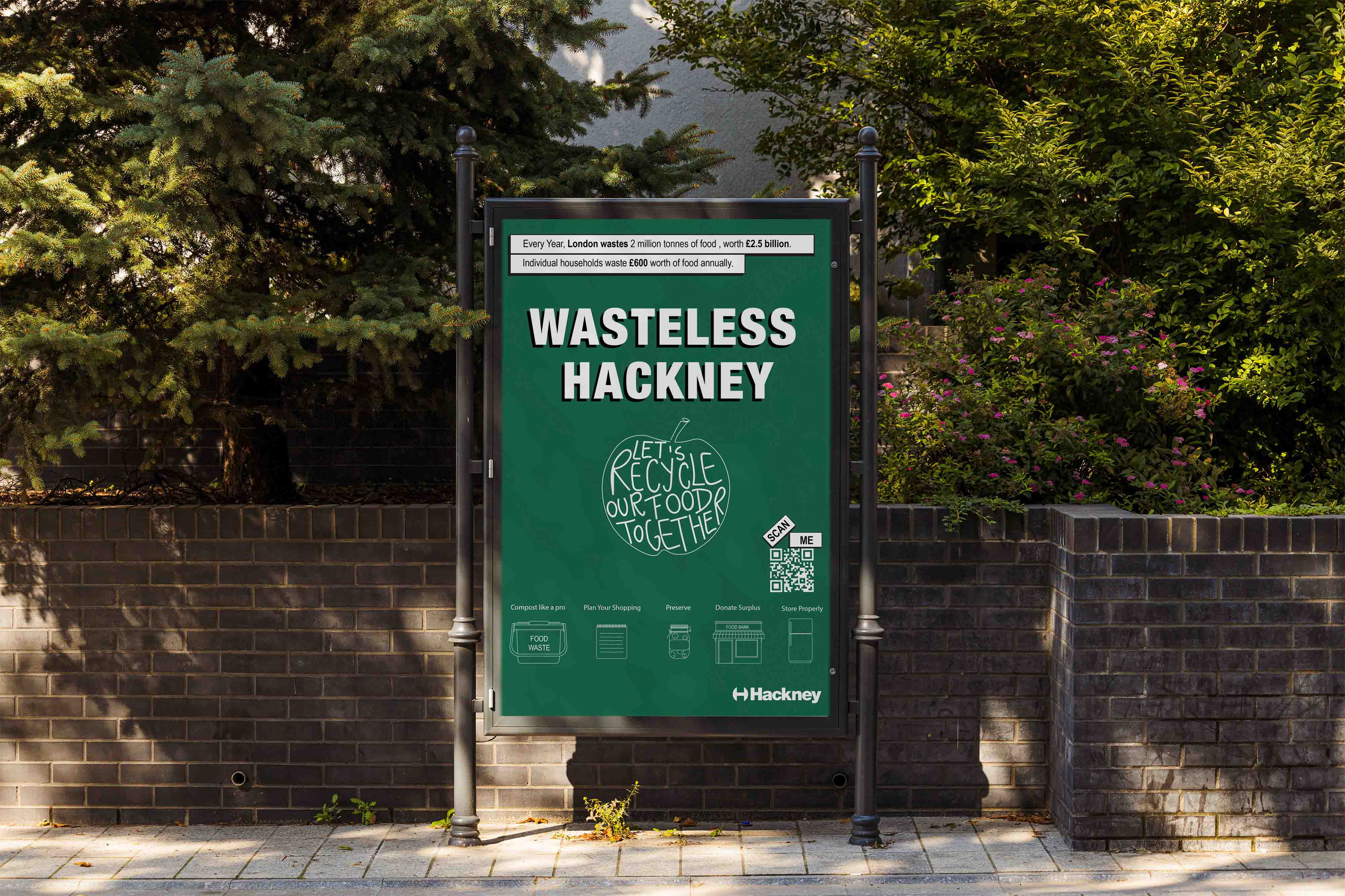
The apple symbol was chosen for its cultural significance, particularly appealing to both British and London audiences. The handwritten style of the text inside the apple adds a personal, relatable touch, helping to create a stronger bond with the audience. This design choice enhances the campaign’s genuine and heartfelt message.
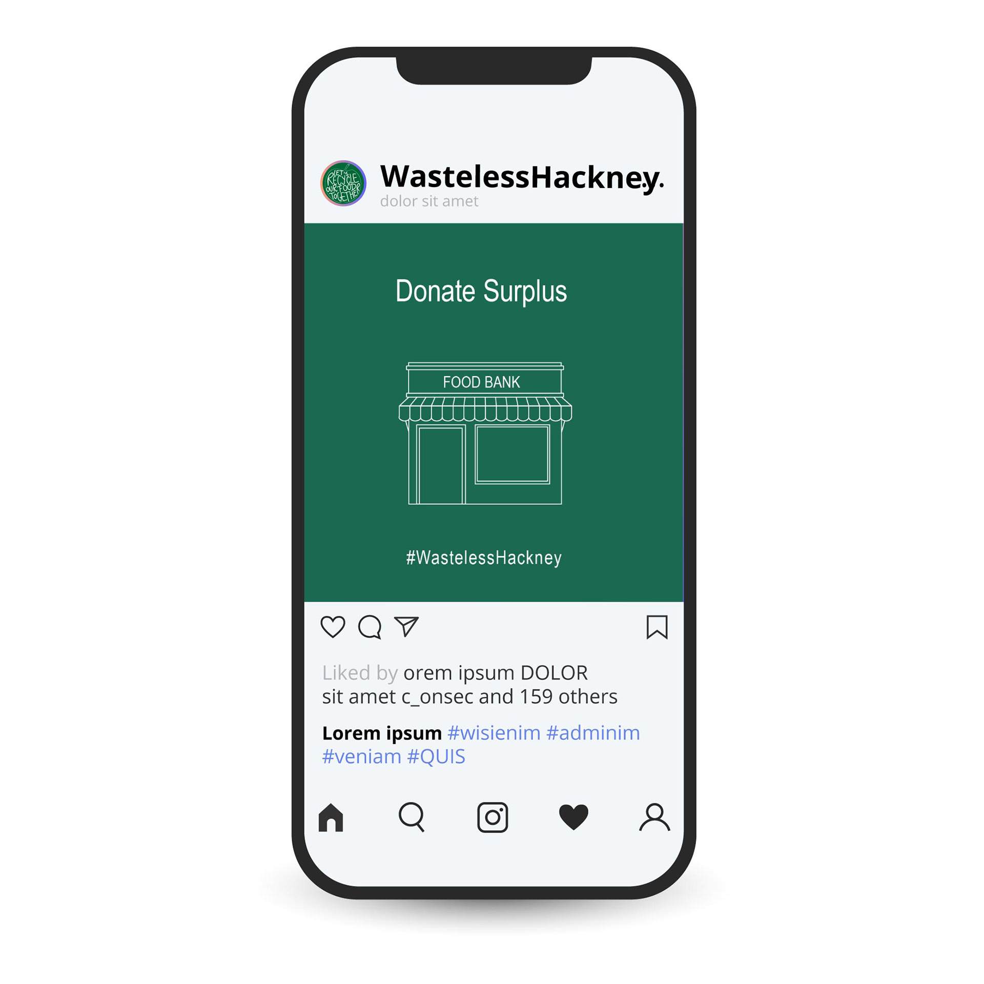
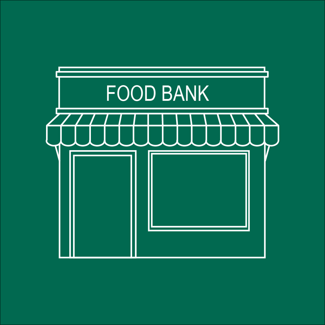
For ease, the solutions are represented in individual line art illustrations. This makes it easier for the audience to understand how they can actively get involved.




POSTER
This campaign seeks to foster a warm and inclusive community spirit by encouraging residents and local businesses to work together on reducing food waste. I designed the poster to not only raise awareness of this important issue but also to offer actionable solutions, ensuring that the focus on food waste is clear and direct.
The apple symbol becomes the main focus of the design.
The phrase ‘Let’s recycle our food together’ directly conveys the campaign’s aim of reducing food waste while also inviting collective action. The use of ‘Let’s’ and ‘Together’ underscores the importance of shared responsibility and community engagement
SOCIAL MEDIA
I chose social media as a platform to educate both the public and local businesses about the impact of food waste on the environment and the economy, as well as to suggest solutions that could help tackle the issue.