The Goal
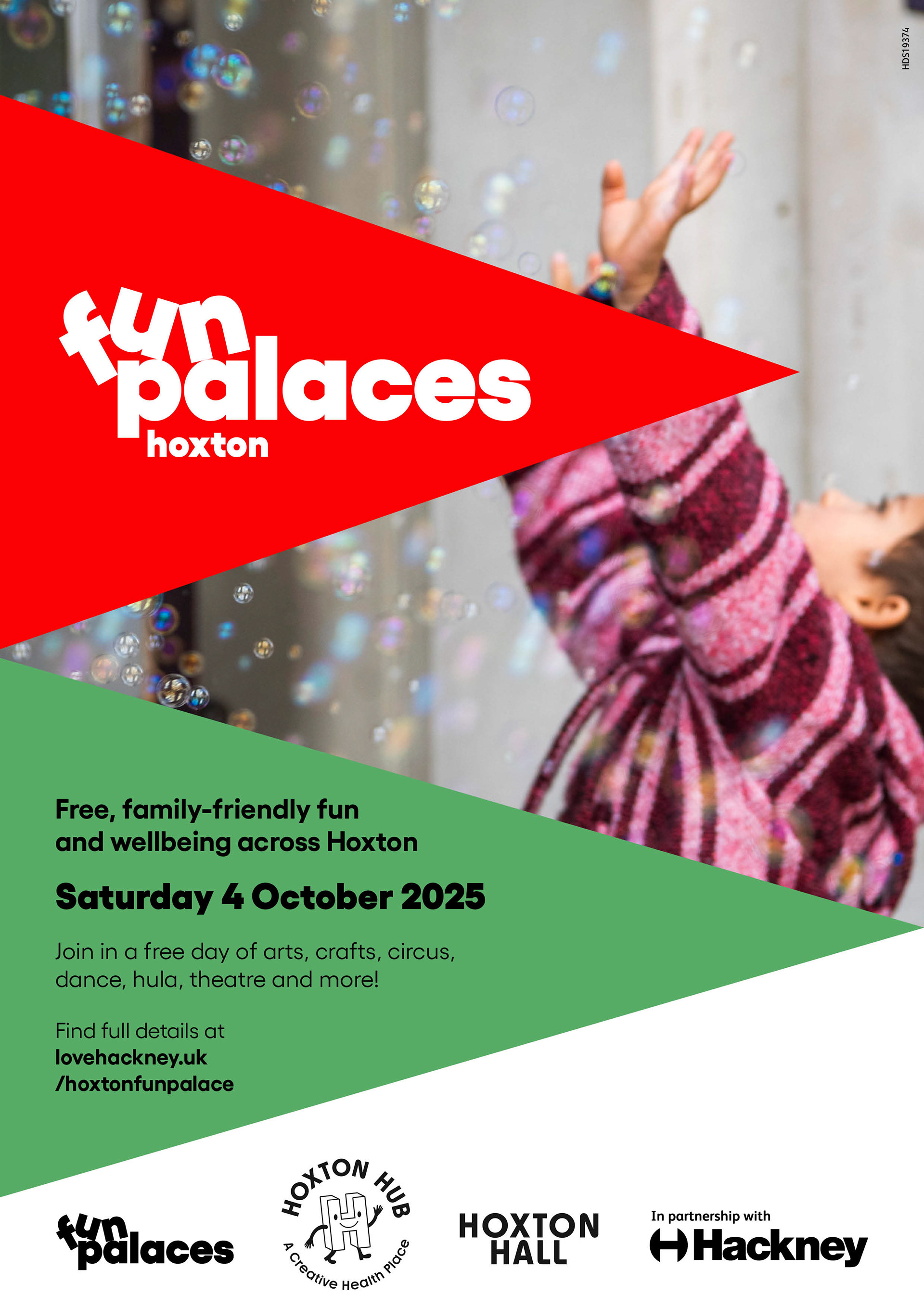
To design an engaging promotional brochure and poster for the Hoxton Fun Palaces local festival, showcasing a diverse schedule of events while strictly adhering to the existing Fun Palaces brand guidelines.
The Strategy & Challenge
The challenge was to work within a predefined visual identity and translate a high volume of event information into a layout that felt exciting, accessible, and community-focused. The final assets needed to organize complex event schedules clearly while maintaining the cheerful, grassroots spirit of the festival.
Brand & Execution
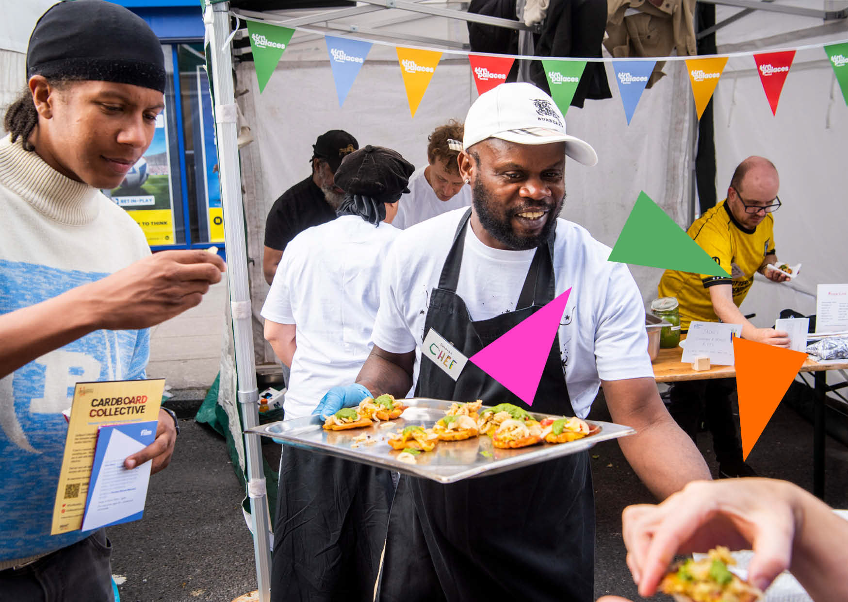
Brand System Alignment: Successfully navigated existing brand guidelines, ensuring perfect alignment with the parent festival’s visual identity while bringing fresh energy into the Hoxton-specific marketing collateral.
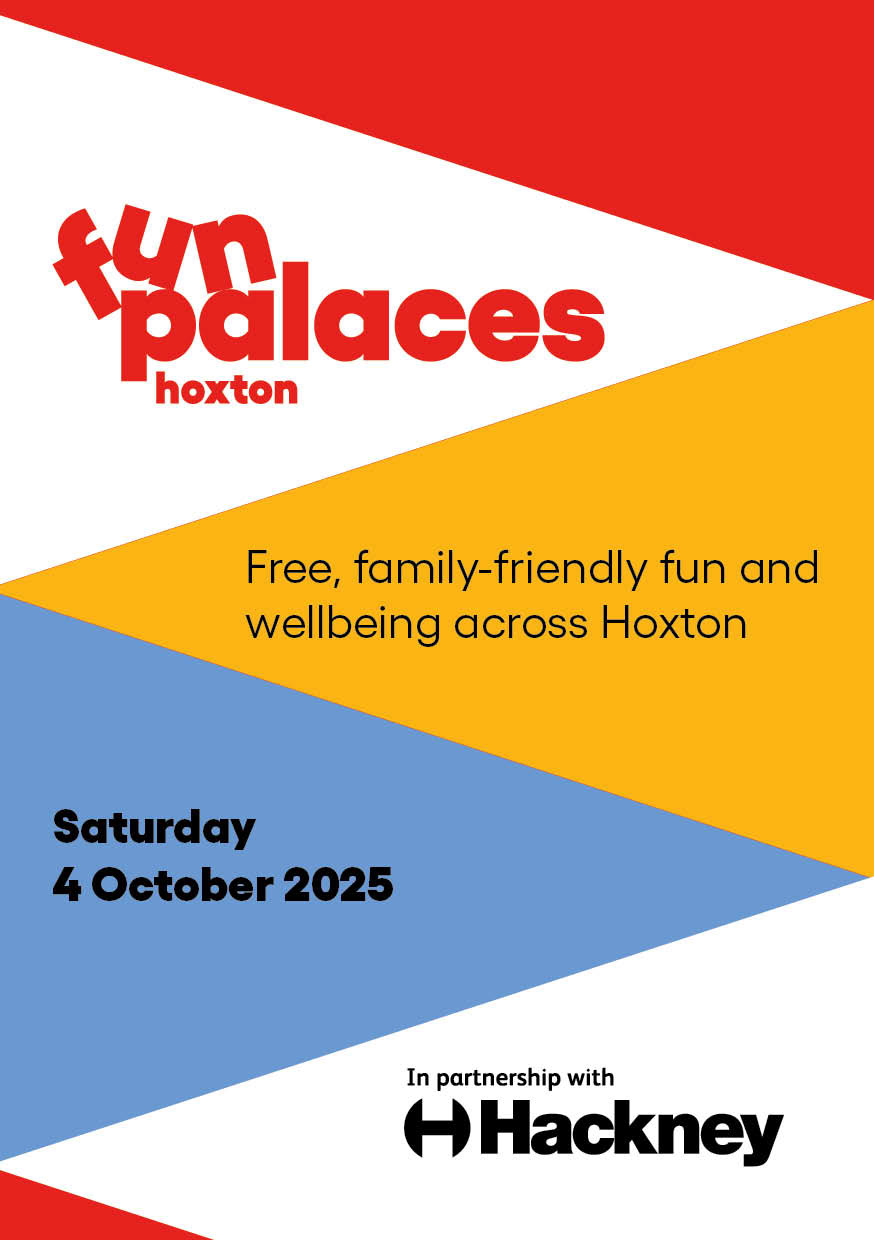
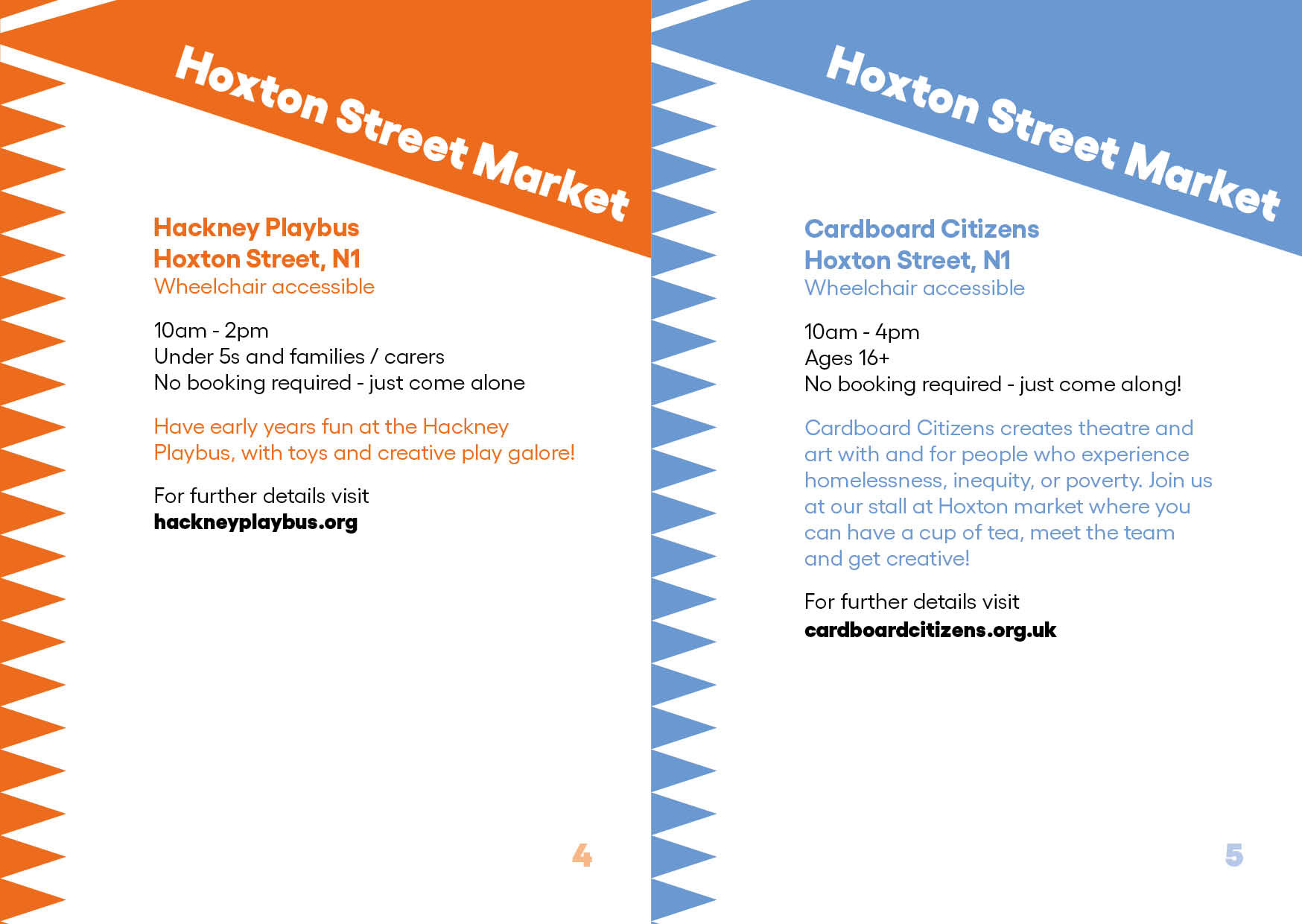
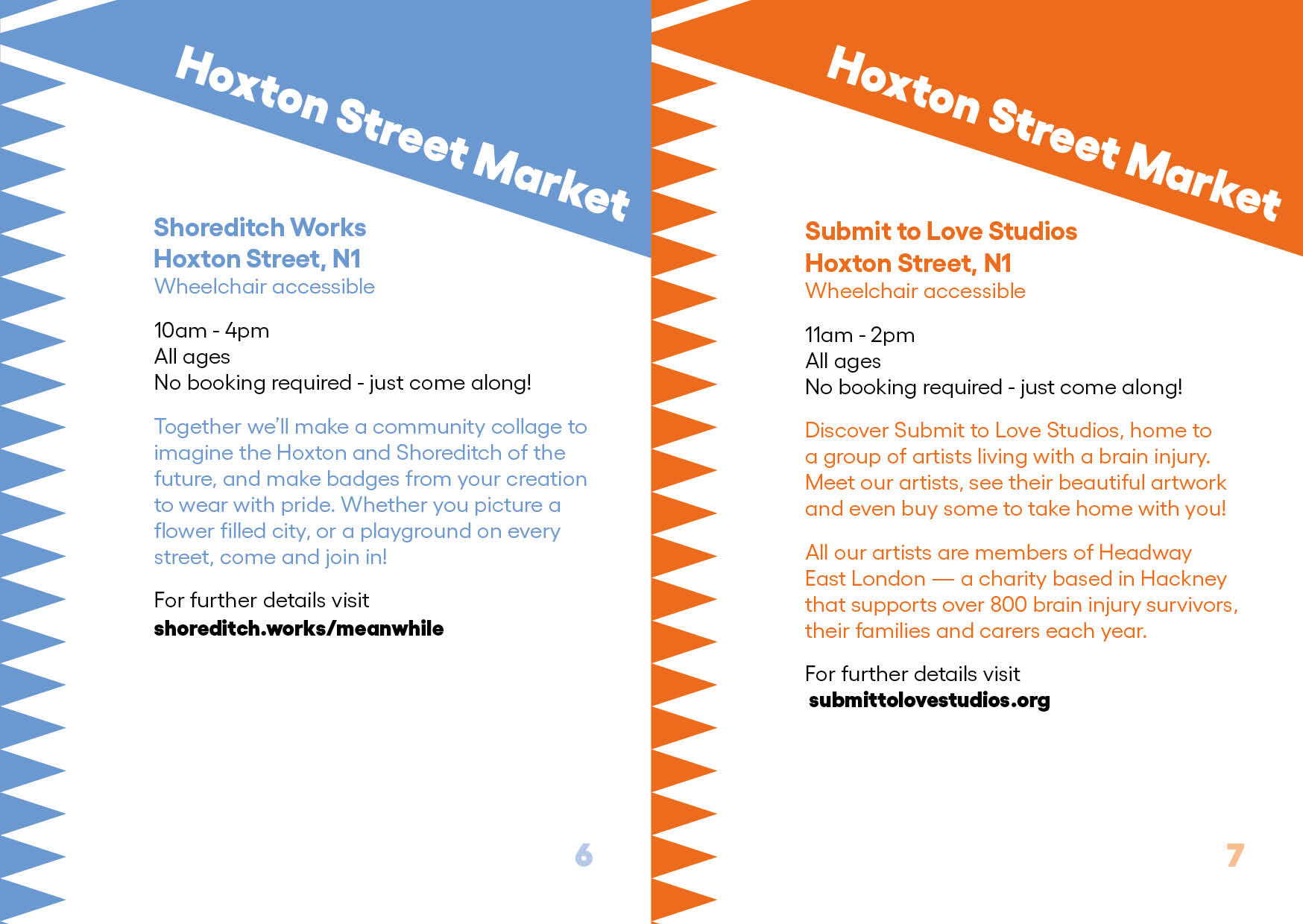
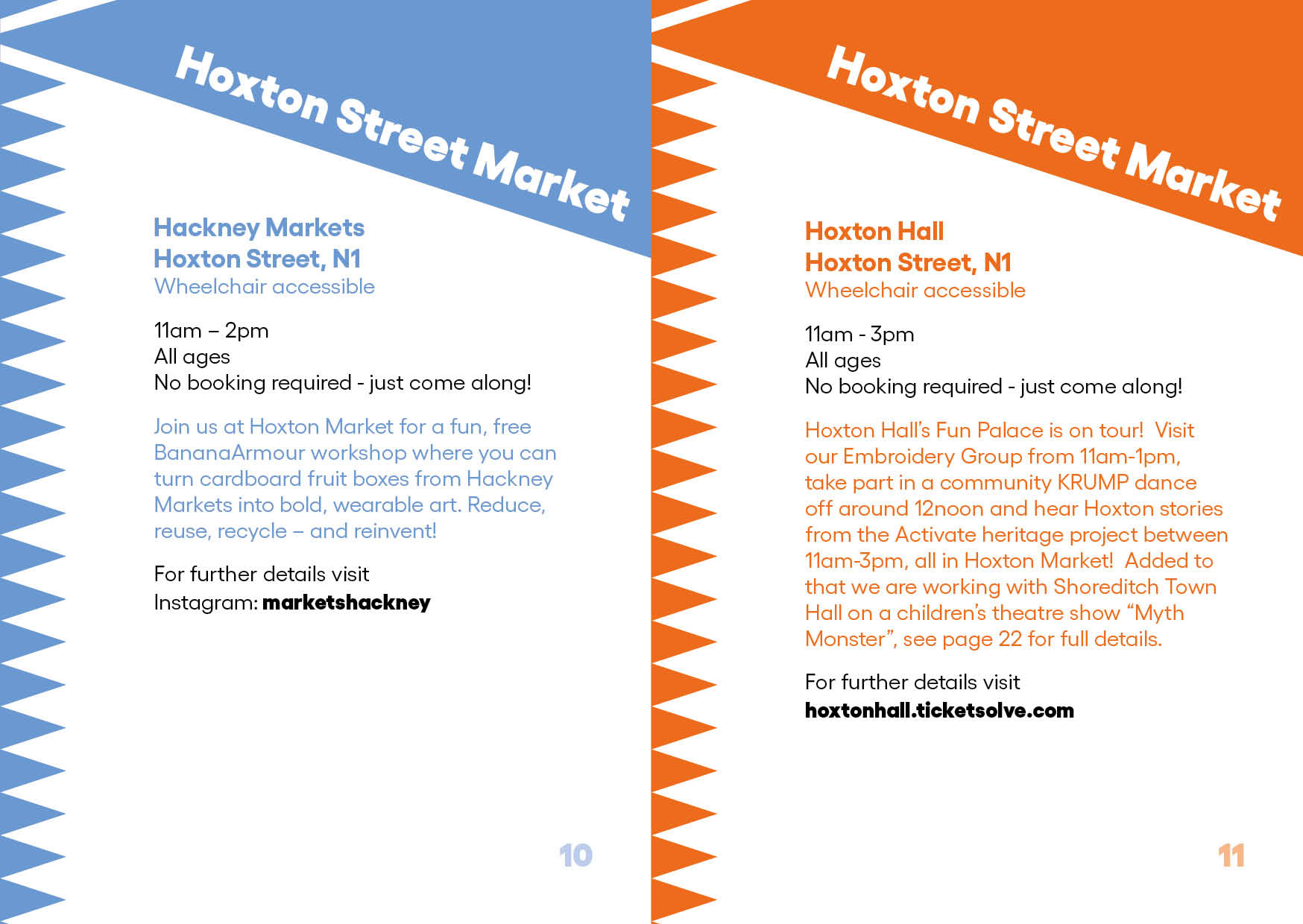
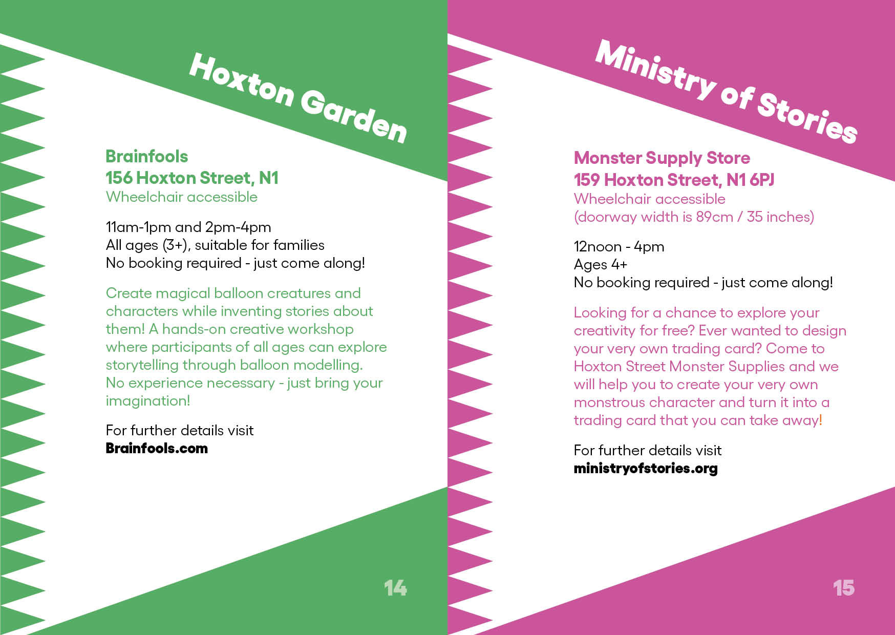
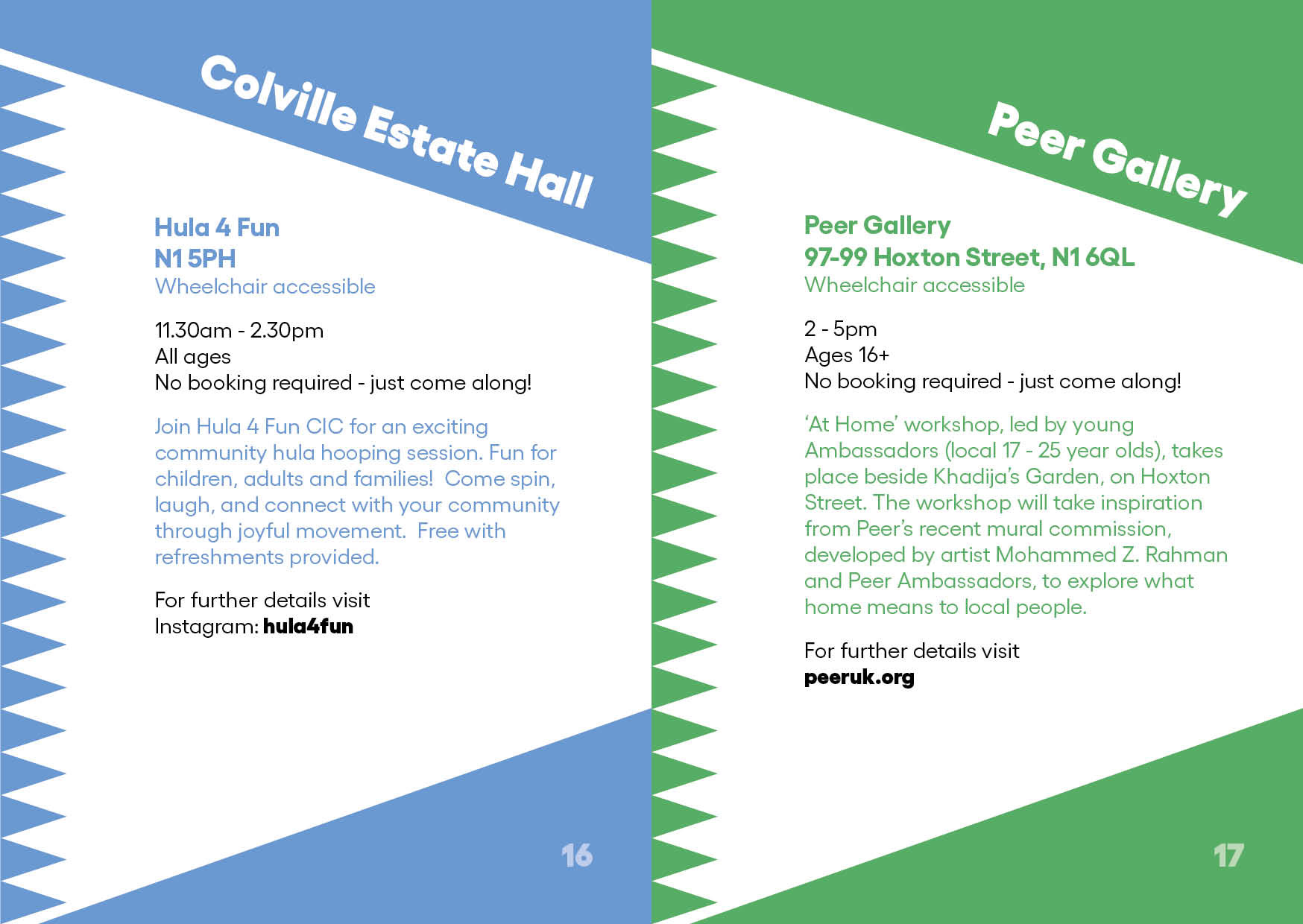
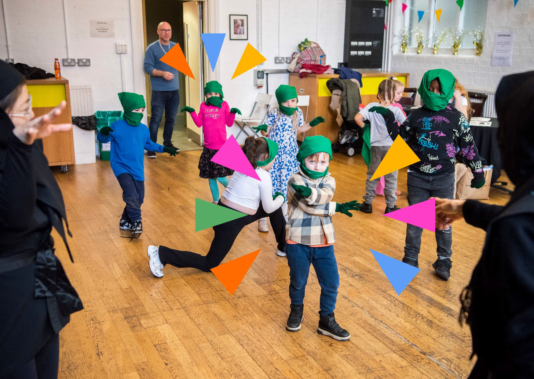
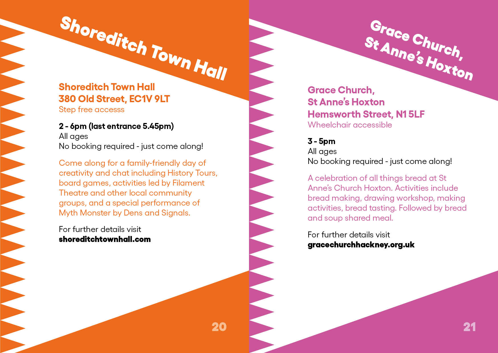
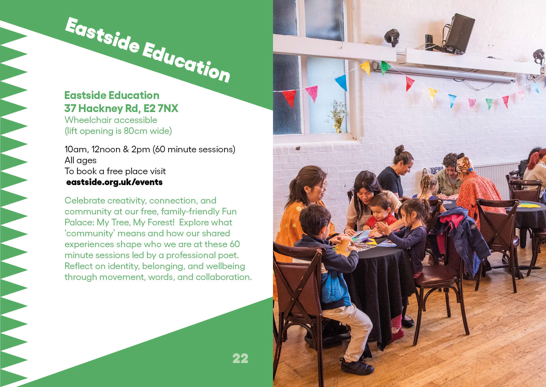
Dynamic Geometry: Used the brand's core triangular shape as a central design element. By applying the triangles in a dynamic, rhythmic layout, the design gains a sense of movement and a joyful, celebratory tone.
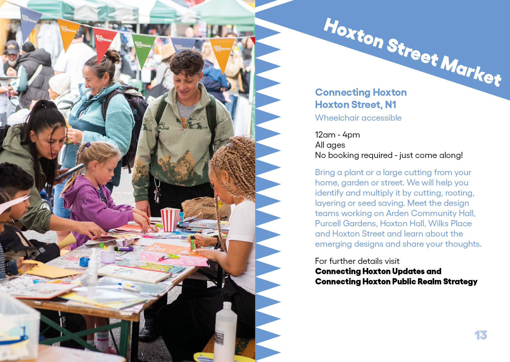
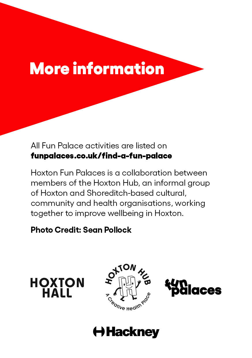
Information Design: Formulated a clean, highly structured typographic grid for the brochure. Complex timetables, venue listings, and activity details were translated into a highly organised, legible, and easy-to-navigate event map for local residents.
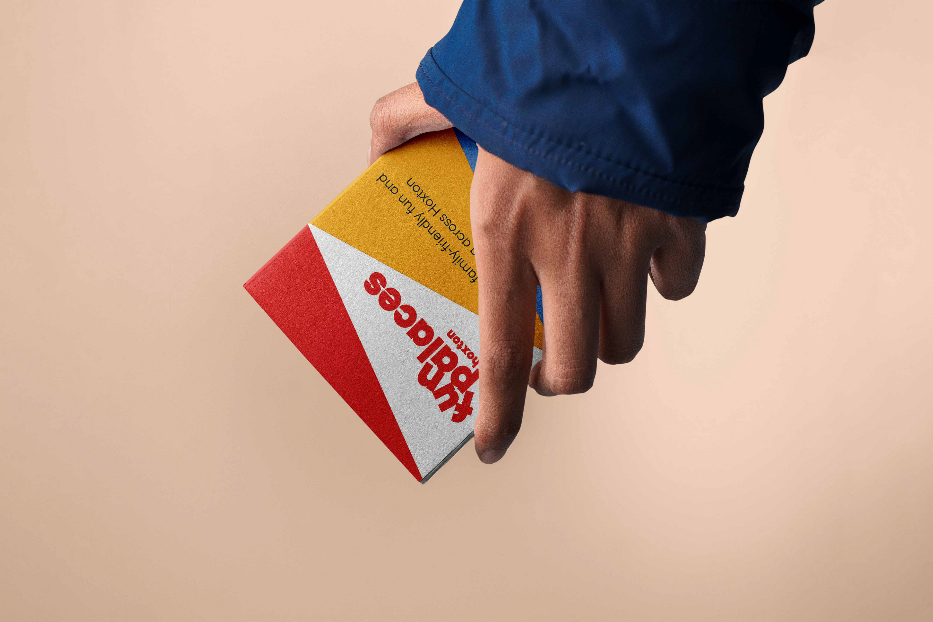
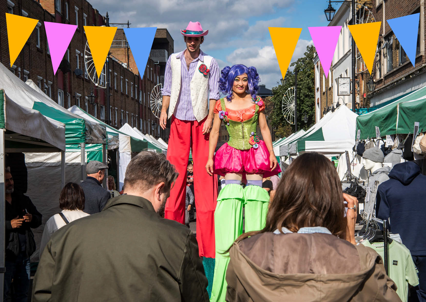
Fun Palaces A5 Brochure