The Goal
To launch an engaging internal campaign promoting the organisation’s updated company values across a diverse public sector workforce.
The Strategy & Challenge:
Employee focus groups requested values that were simple, statement-based, and easy to memorise. In response, the visual direction prioritised raw typographic clarity over illustration.
Brand & Execution
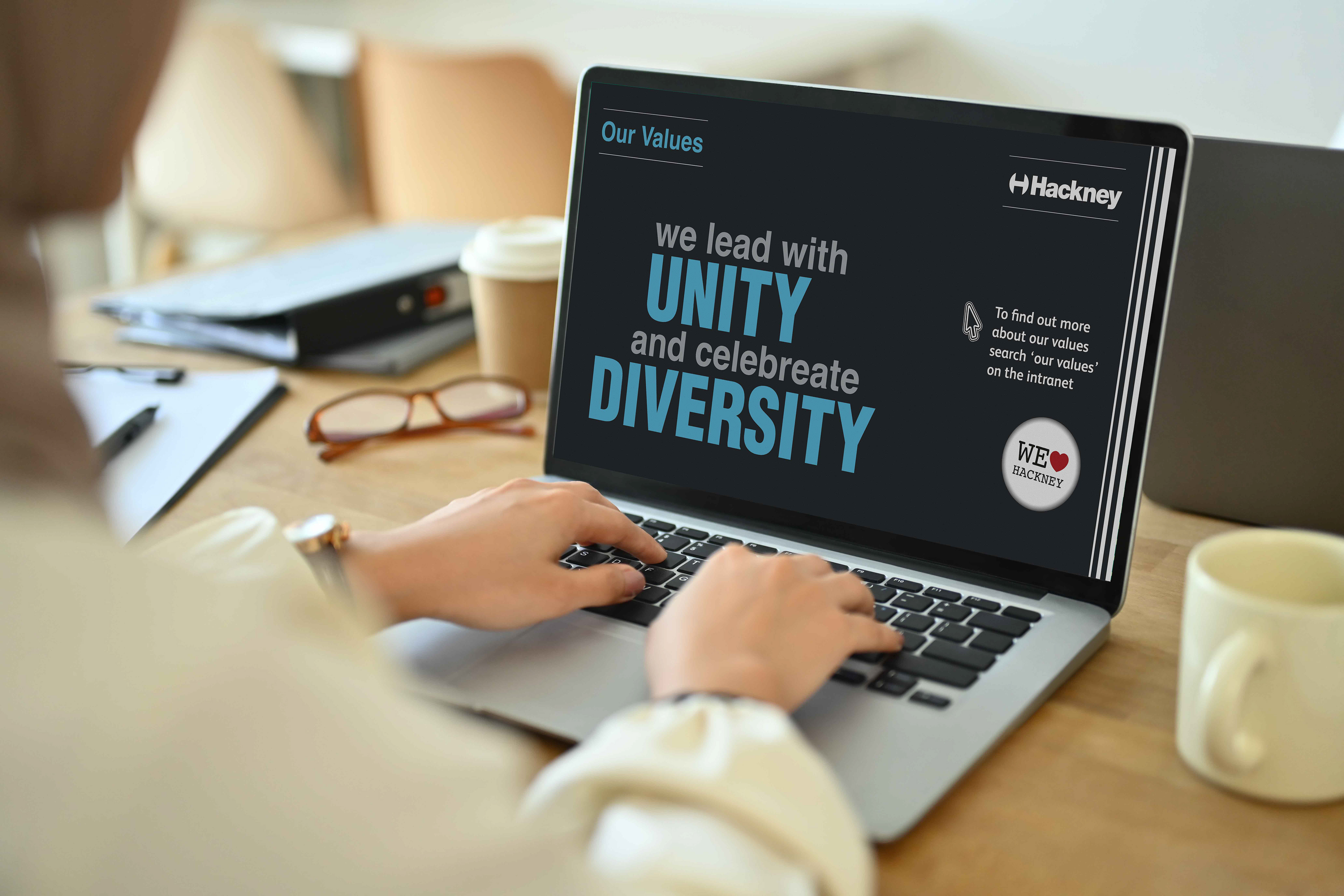
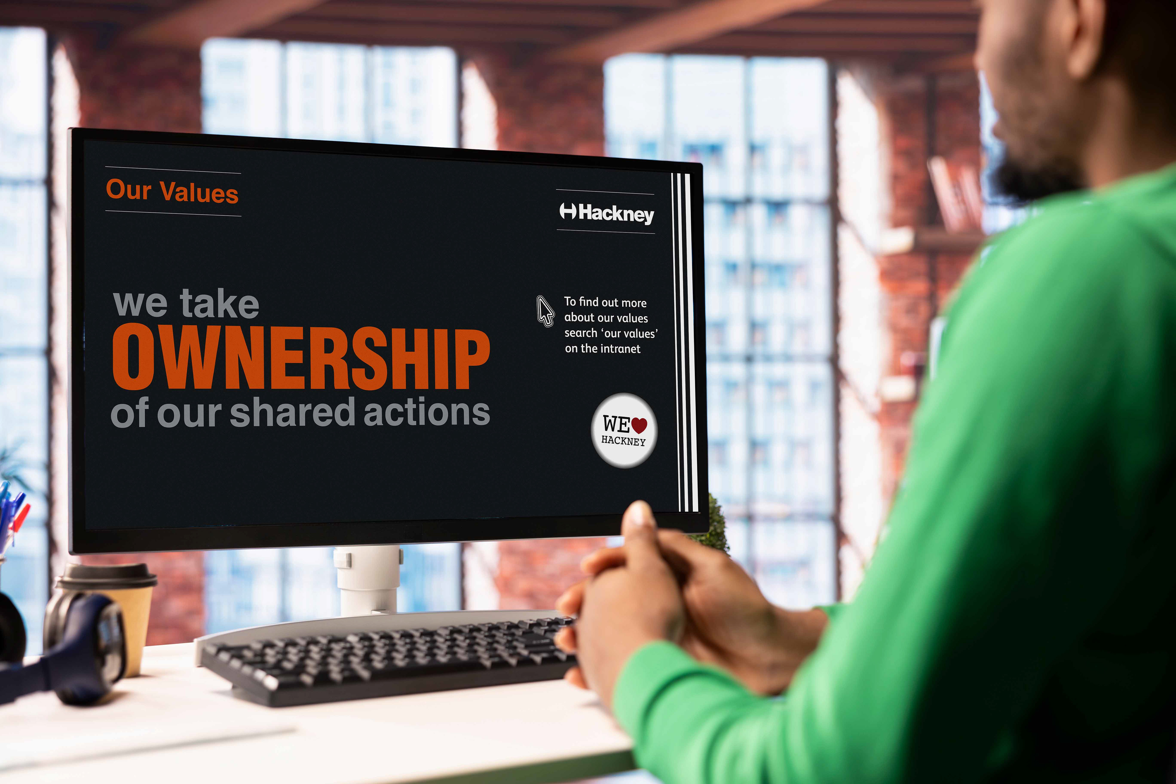
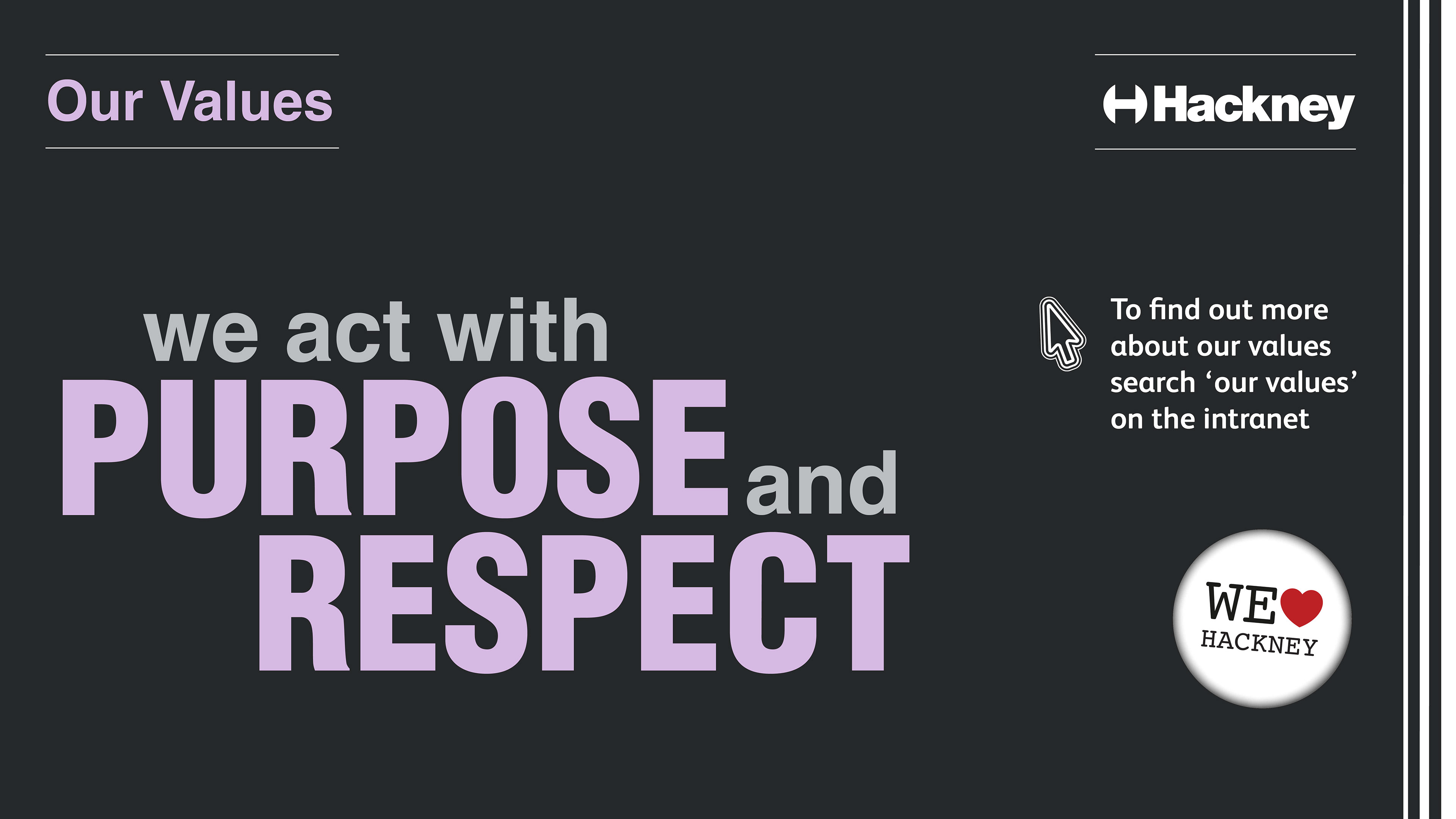
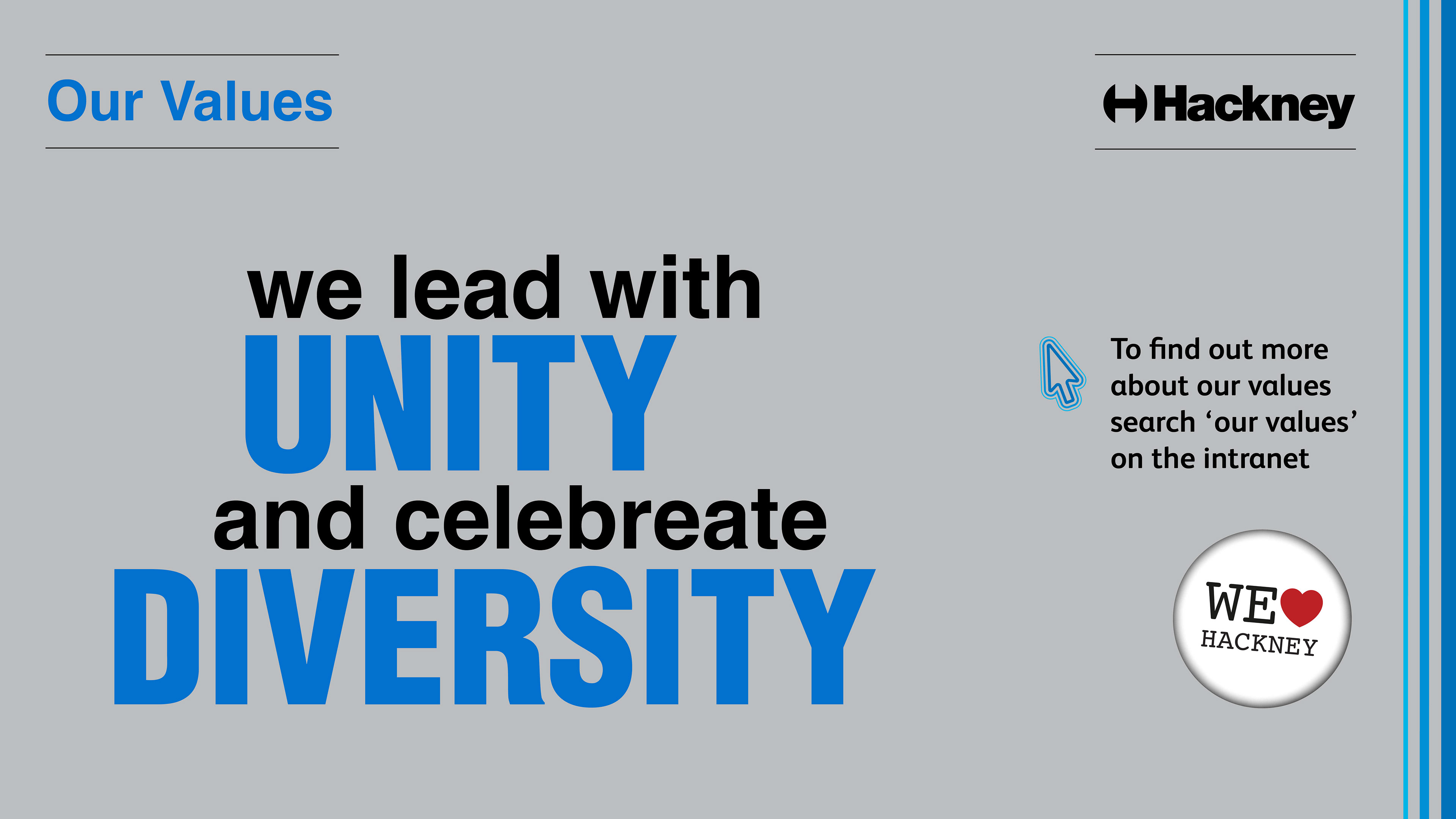
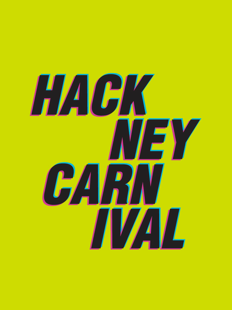
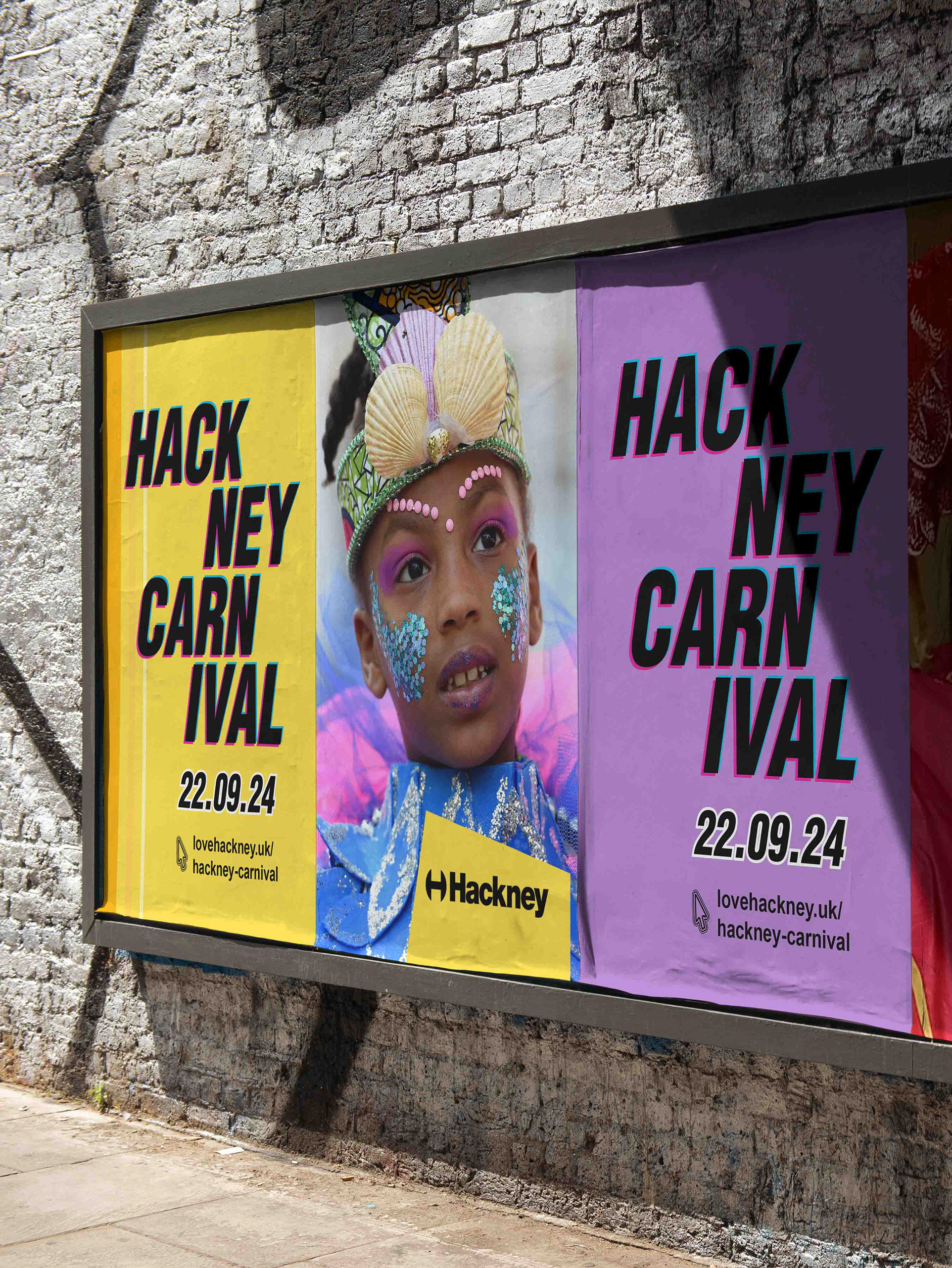
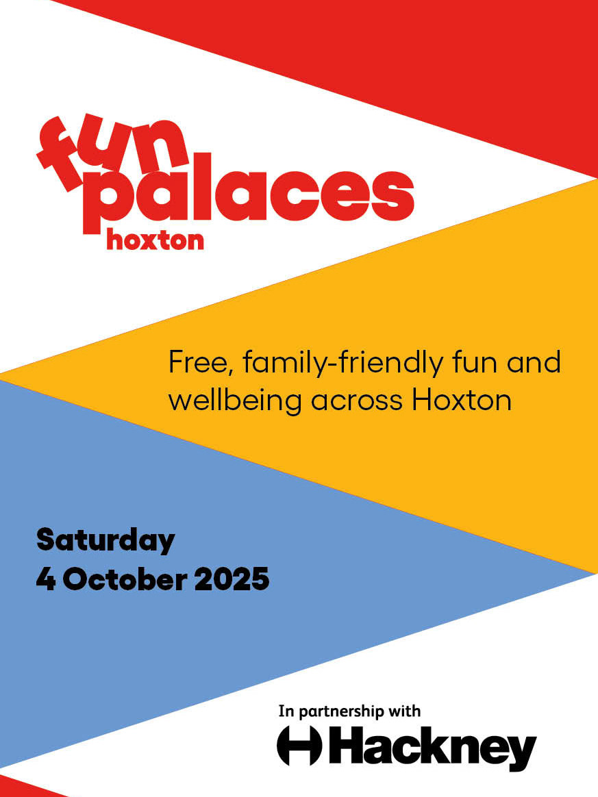
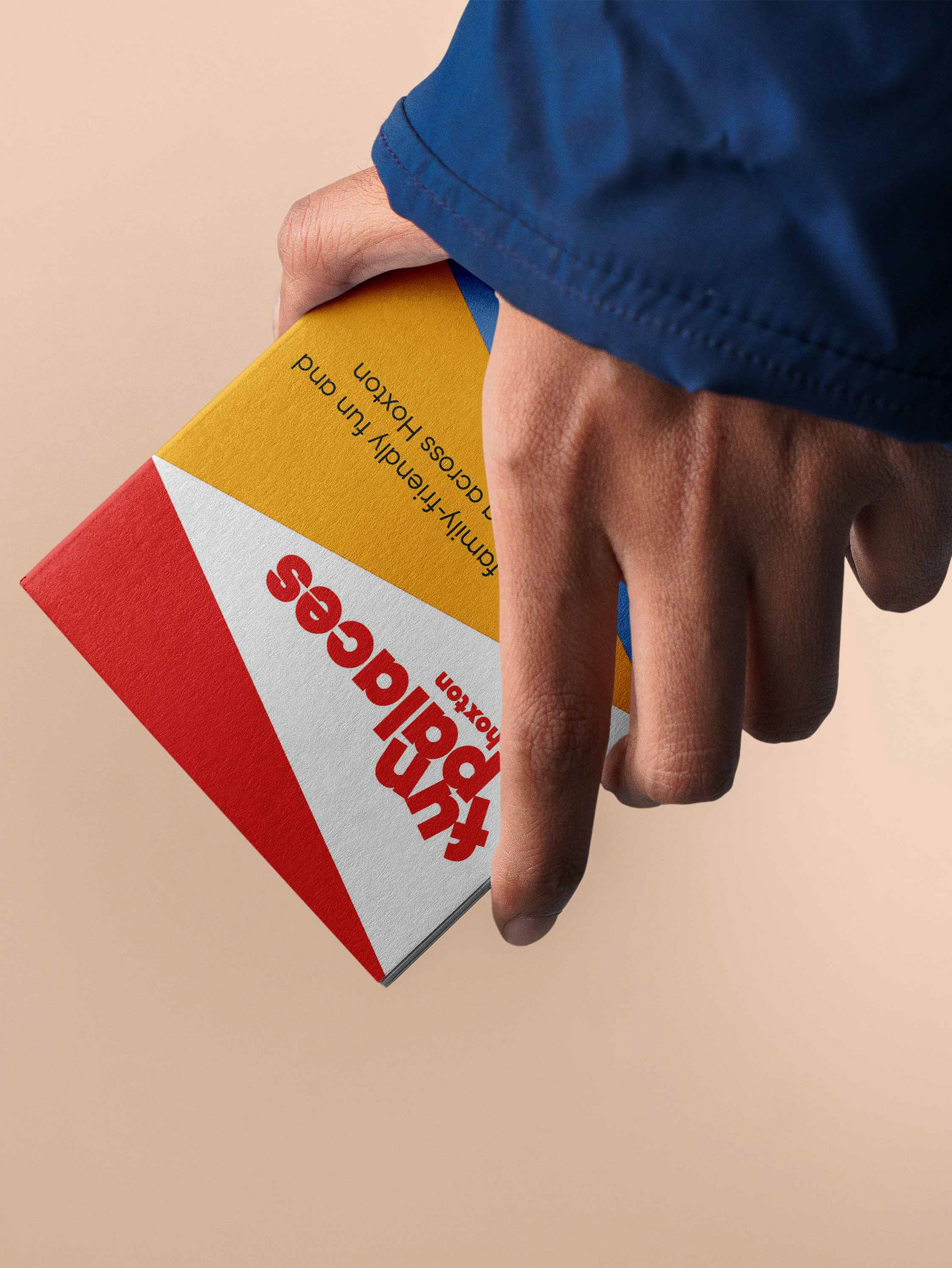
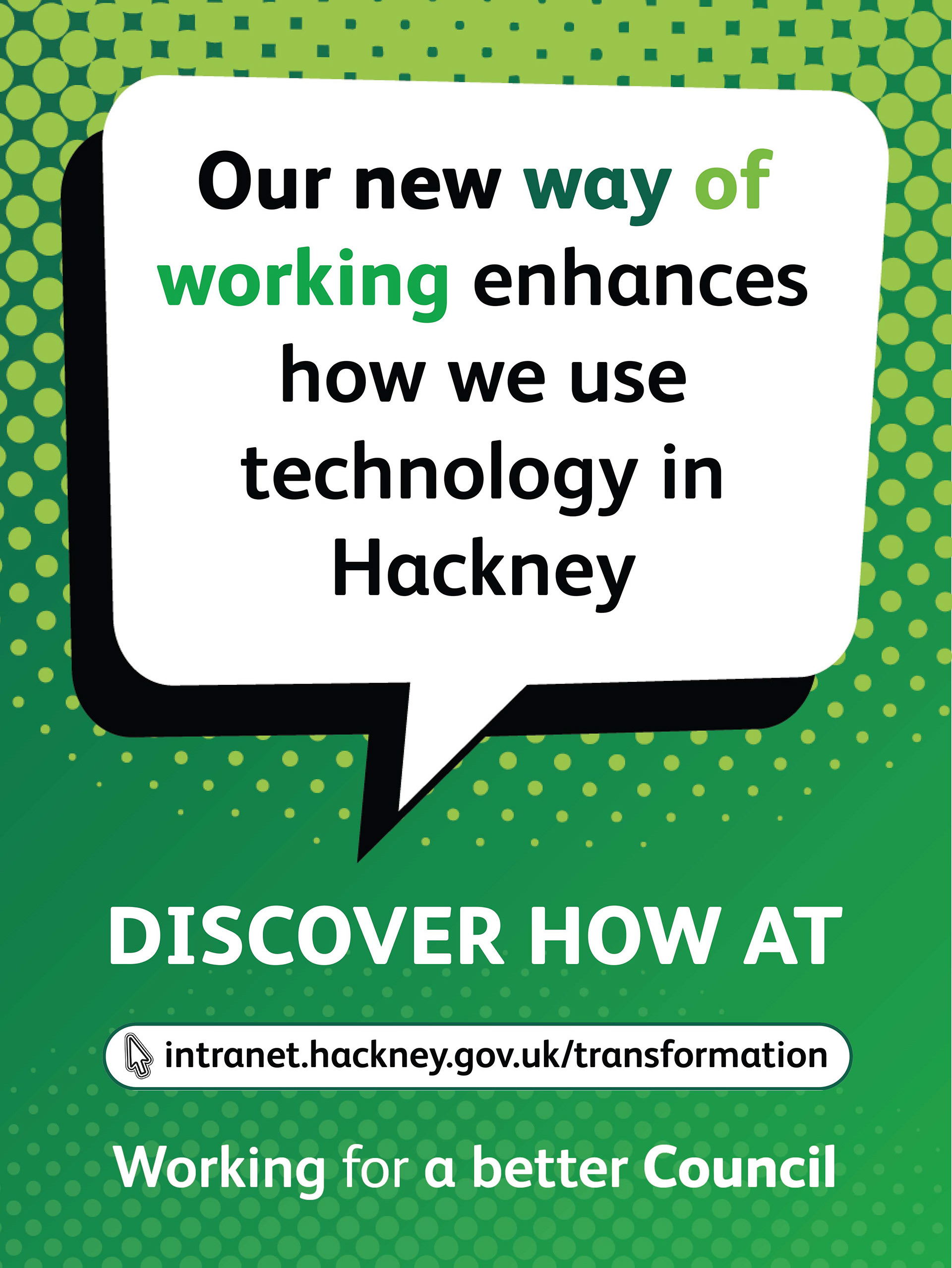
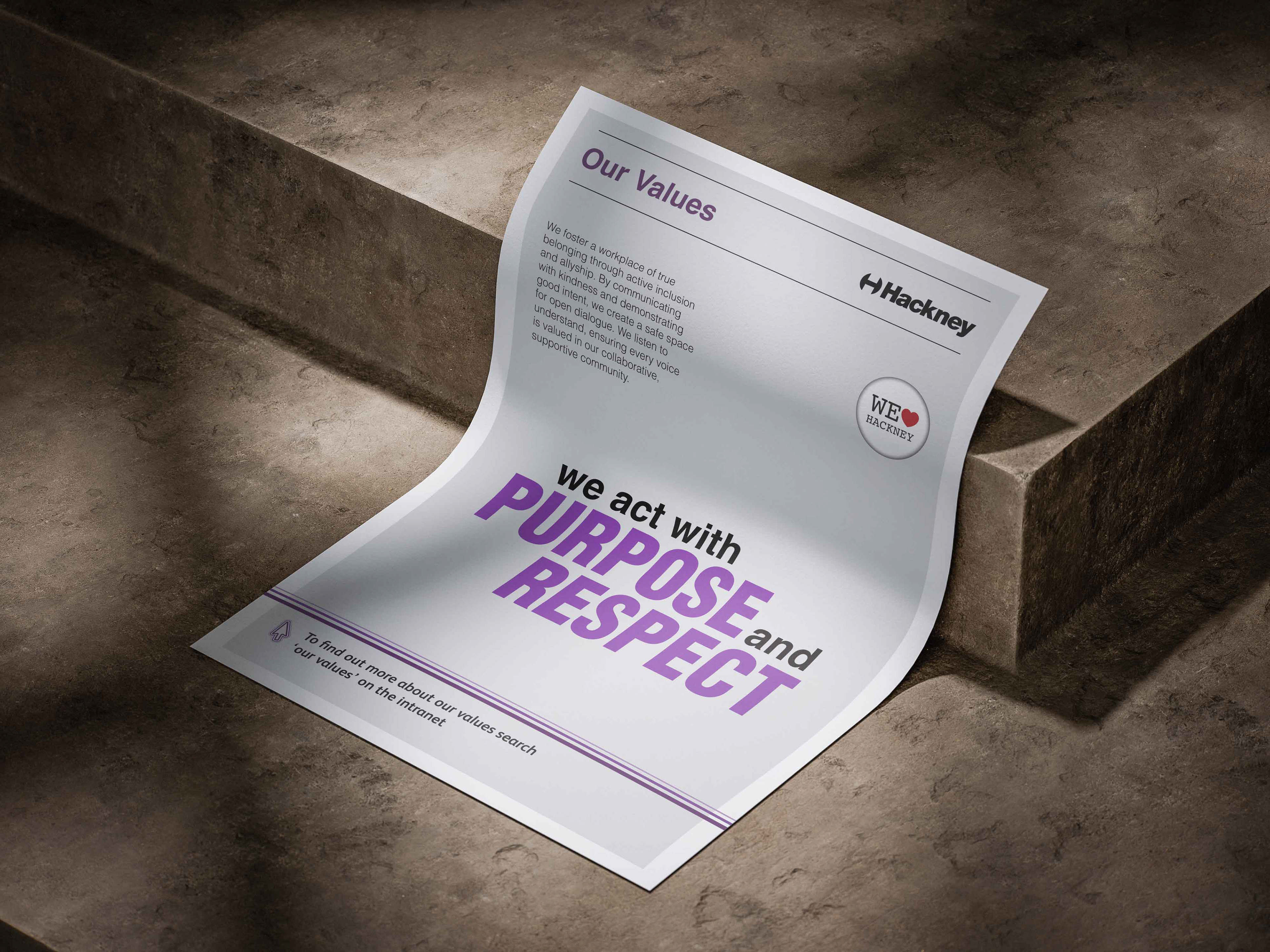
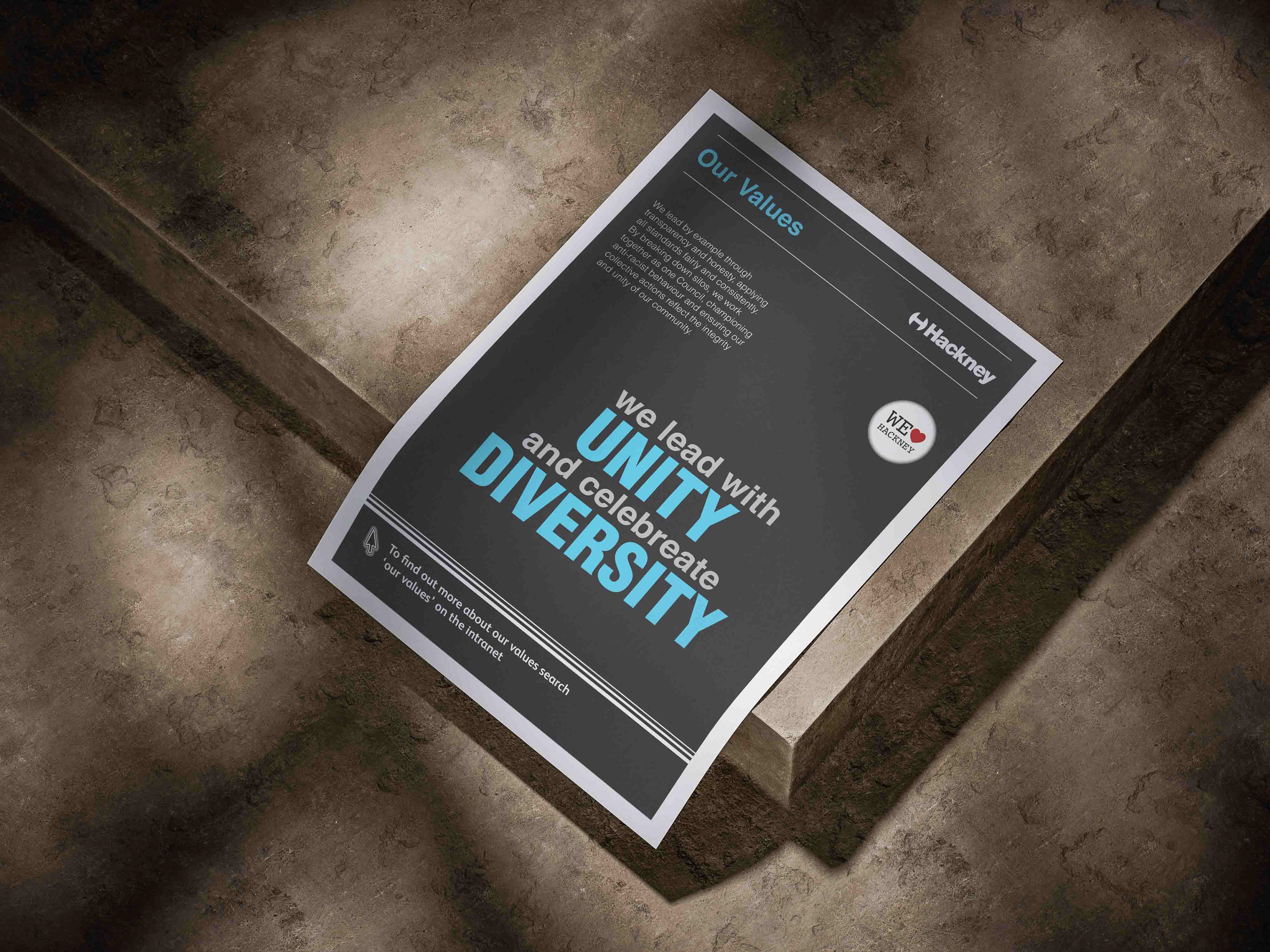
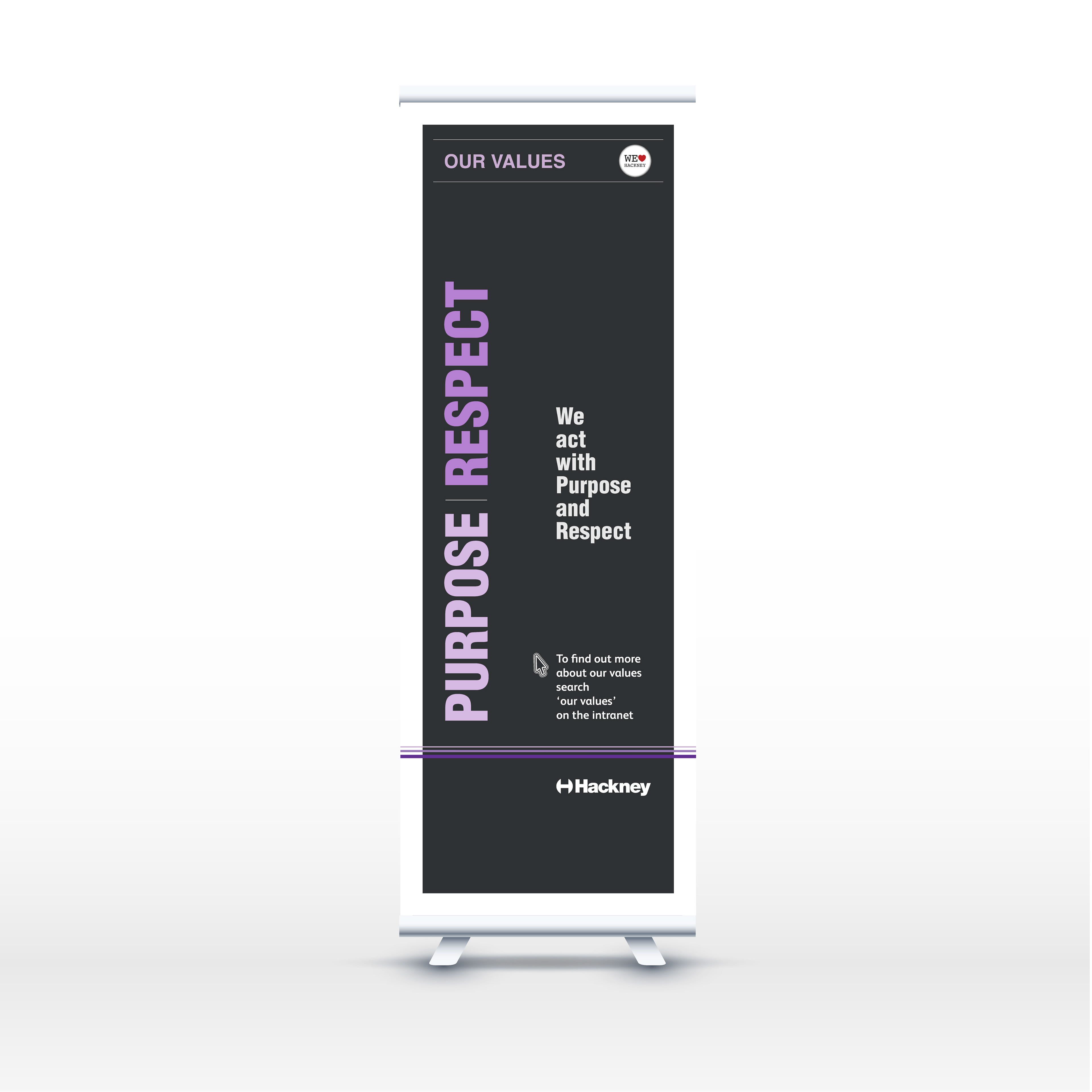
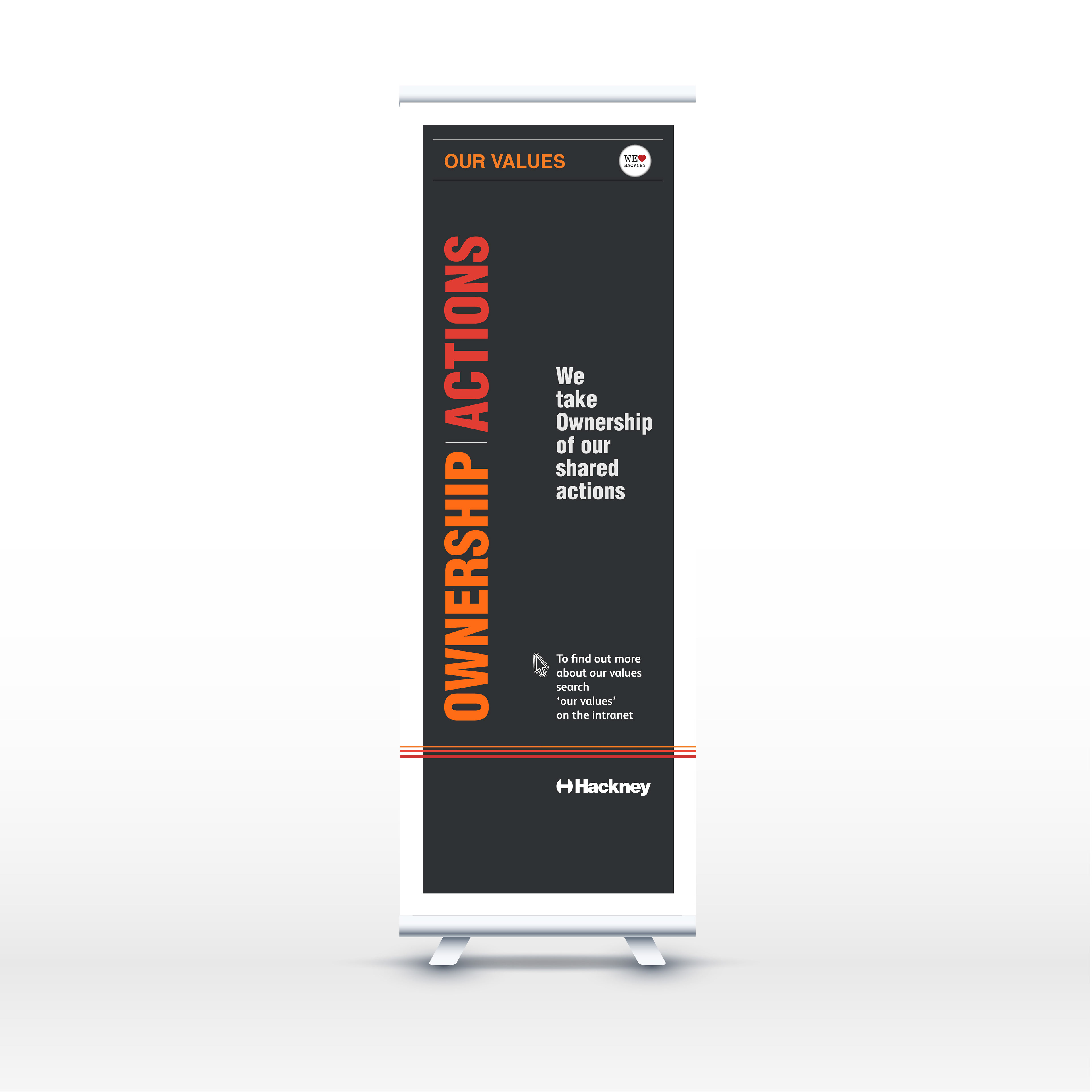
Visual Language: A bold, minimalist identity inspired by classic Swiss Design and modernist poster layouts. To balance this structured, high-impact aesthetic with community warmth, we integrated the beloved WeLoveHackney badge, bridging raw, functional design with a trusted local identity.
Colour Strategy: A vibrant colour contrast designed to stand out in busy corporate environments while maintaining accessibility standards.
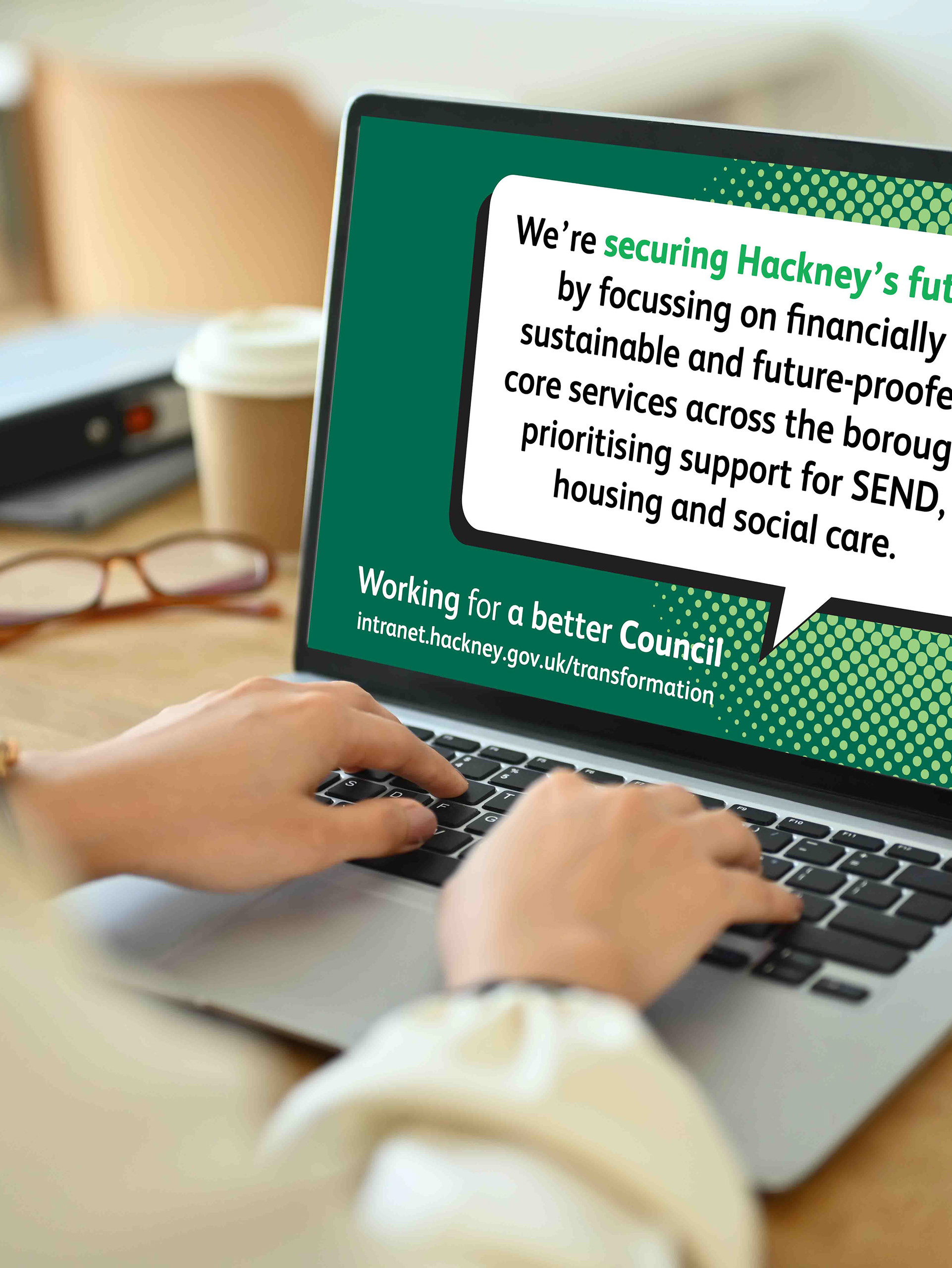
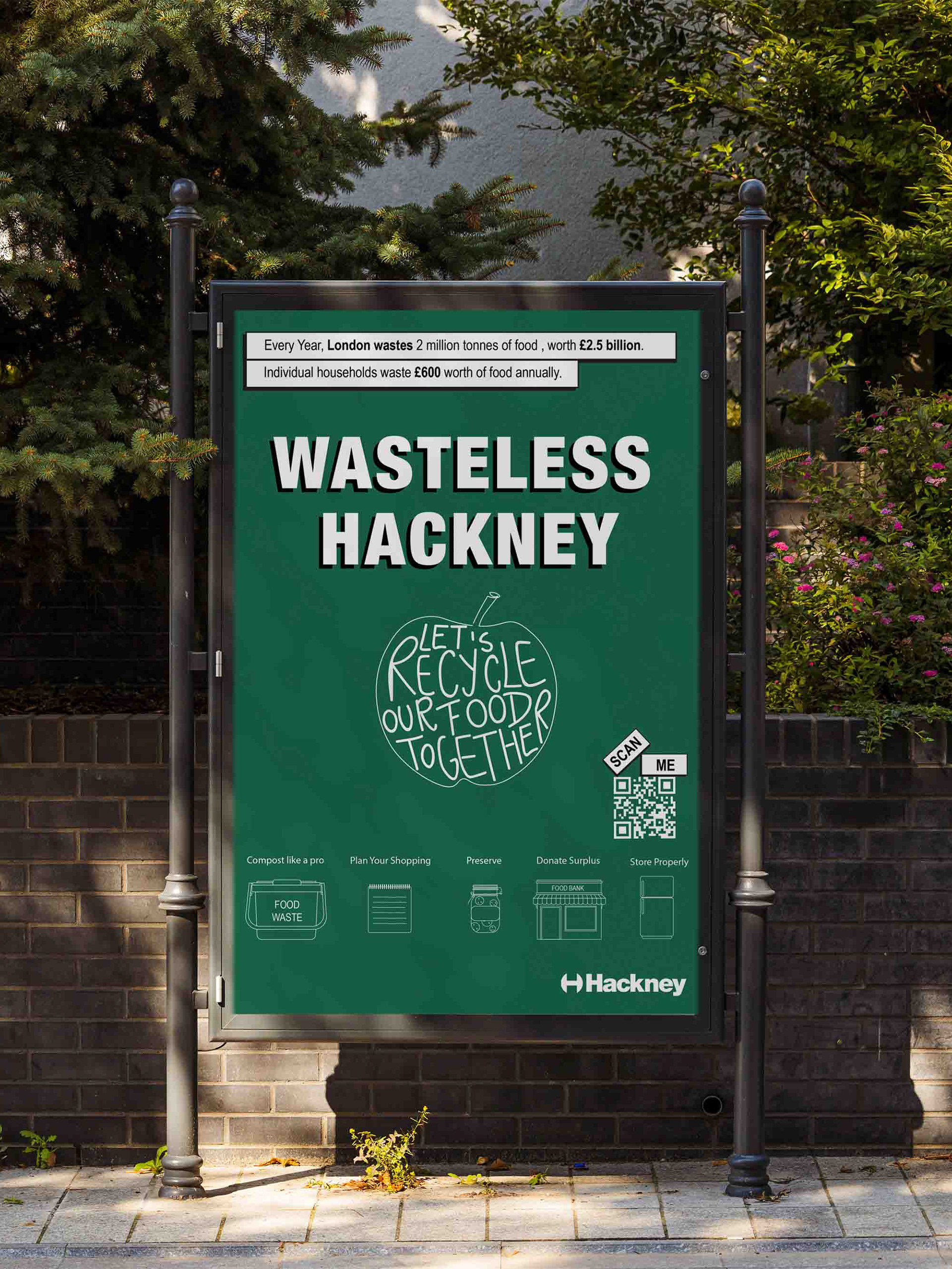
Typography Hierarchy: A strict, grid-based typographic hierarchy using heavy weights for instant scannability on physical posters, office displays, and intranet banners.
Posters
Pull up Banners
Digital Screens