

BRIEF
I was tasked with designing the visual identity for the 2024 Hackney Carnival. The brief drew inspiration from early-2000s rave culture, while celebrating the borough’s diverse community. The campaign needed to feel joyful, inclusive and family-friendly, capturing the spirit of Carnival in a way that felt accessible to everyone.
DELIVERABLES
• Logo
• Billboards
• Social Media
• Procession Route Map & Static Sites
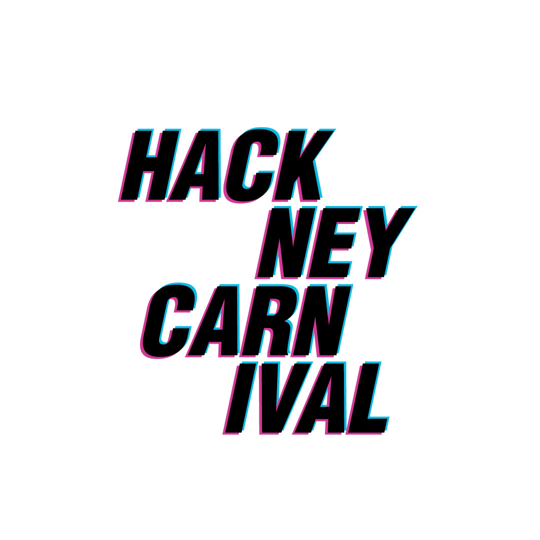
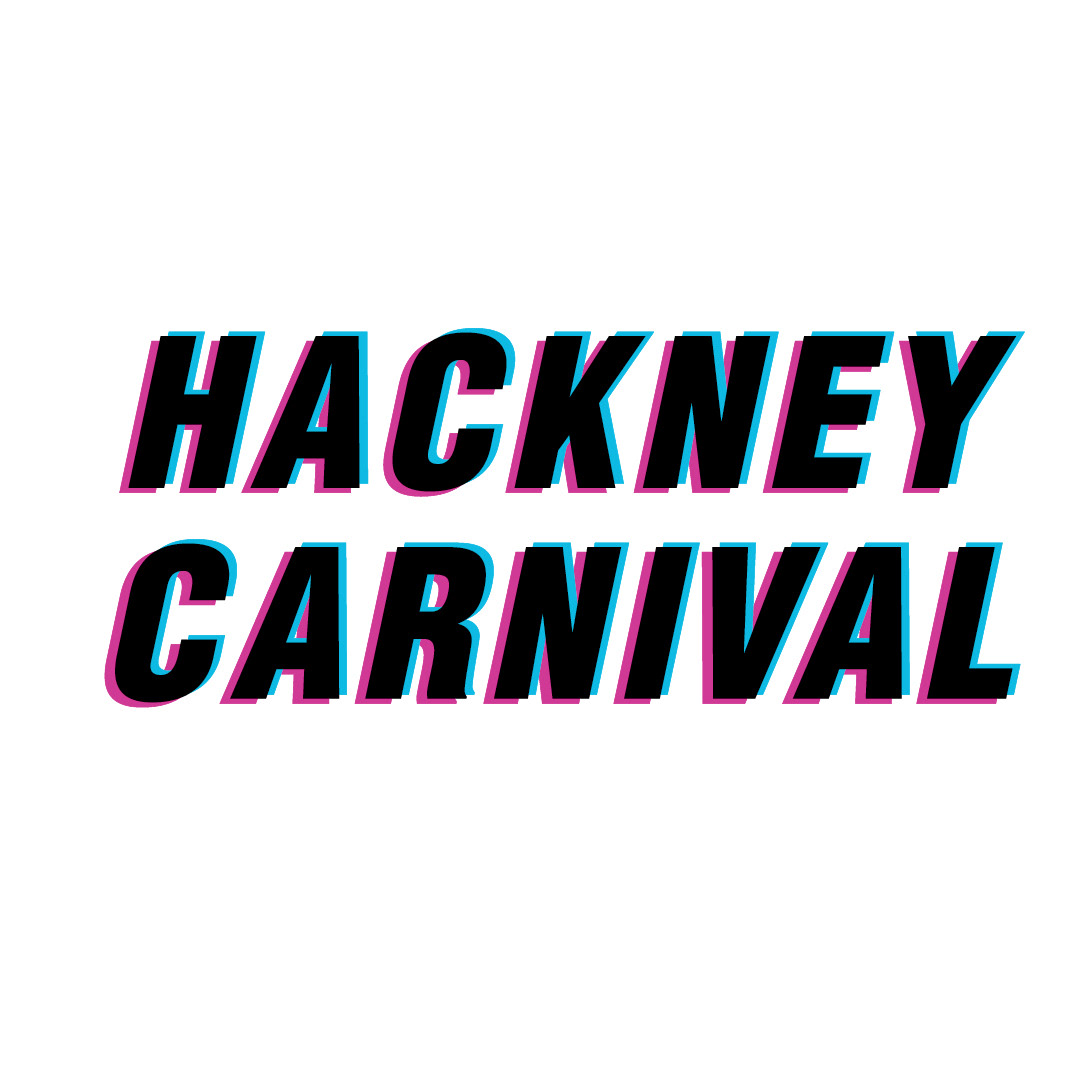
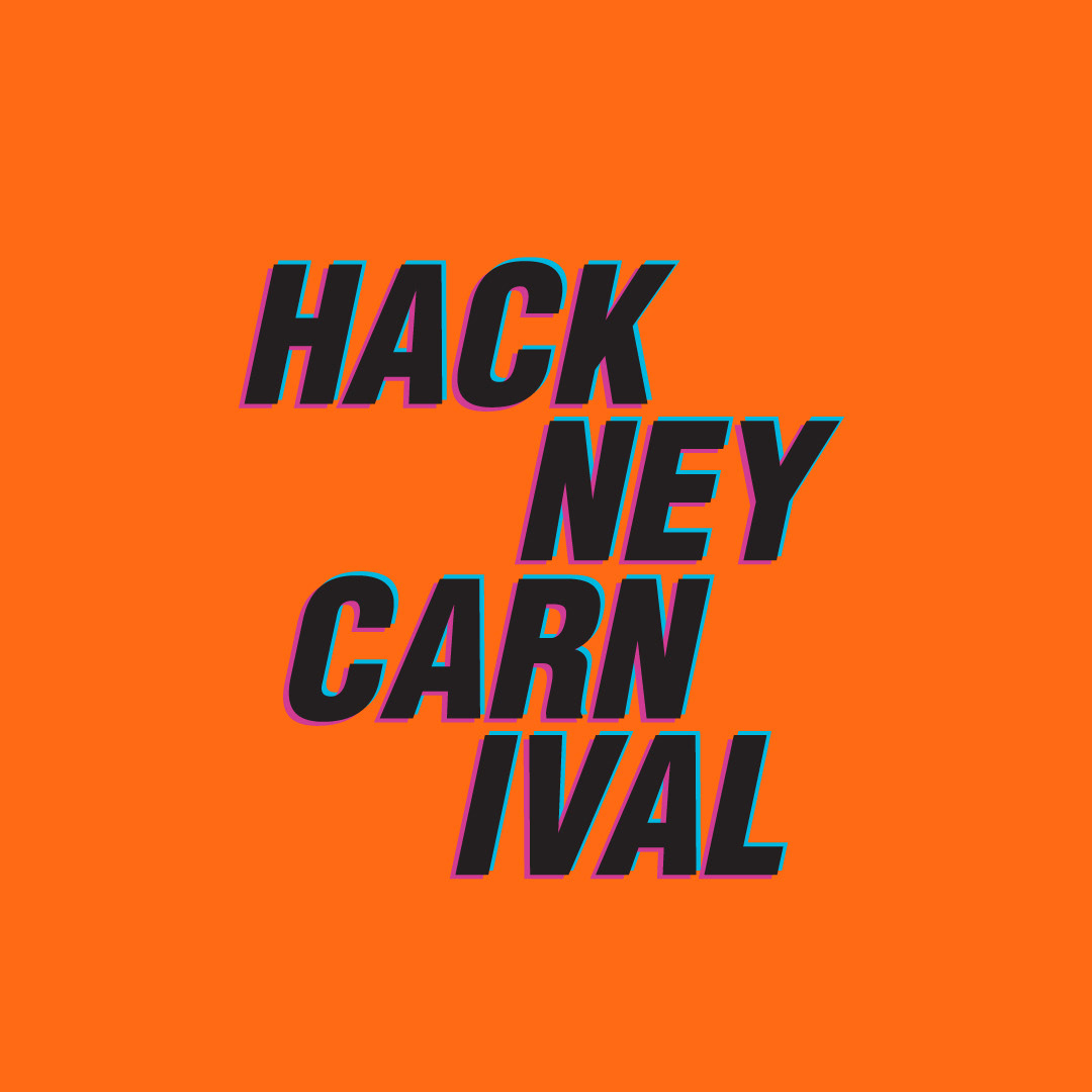
LOGO
The logo uses an anaglyph text effect to reference early digital design, creating a sense of nostalgia while still feeling playful and contemporary. The overlapping colours and subtle 3D illusion give the typography depth and movement, helping it stand out across both print and digital formats.
COLOUR PALETTE
A bold, vibrant colour palette was developed to support the anaglyph logo and reinforce the celebratory tone of the campaign. Various colour combinations were tested using the existing corporate palette, with this final selection chosen for its energy, clarity and strong visual impact.
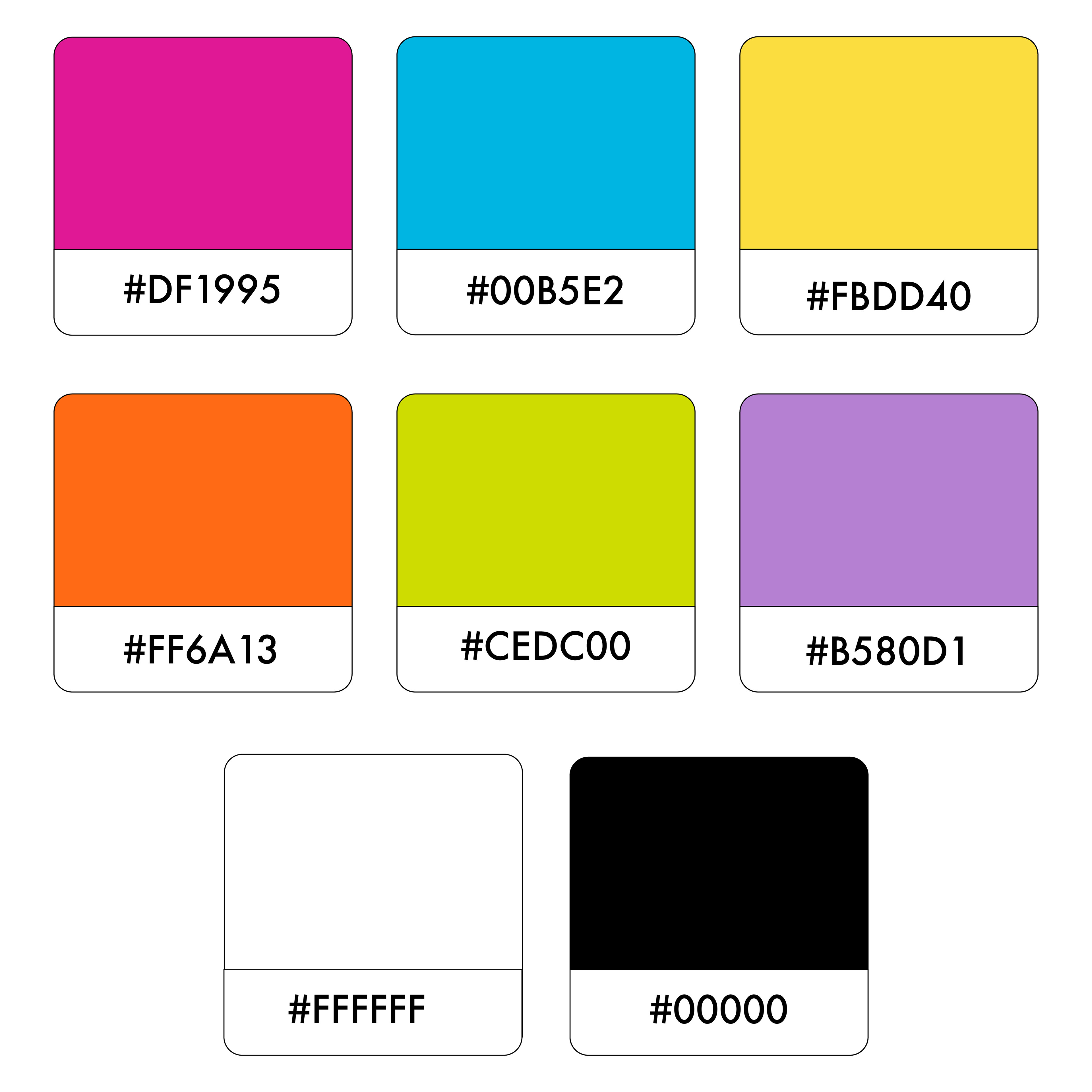
Logo Exploration
While developing the campaign, we tested the offset logos on different colours from the corporate colour palette, and this colour variation proved to be the best option for our go-to vibe for the carnival.
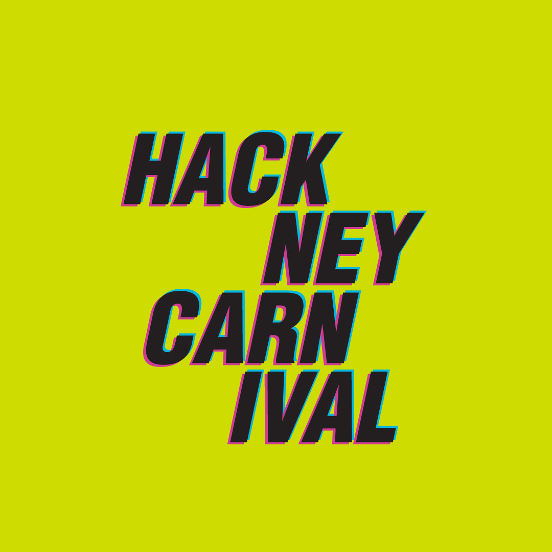
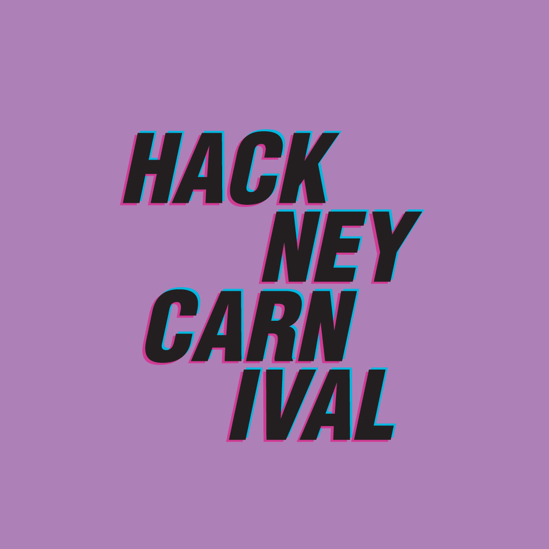
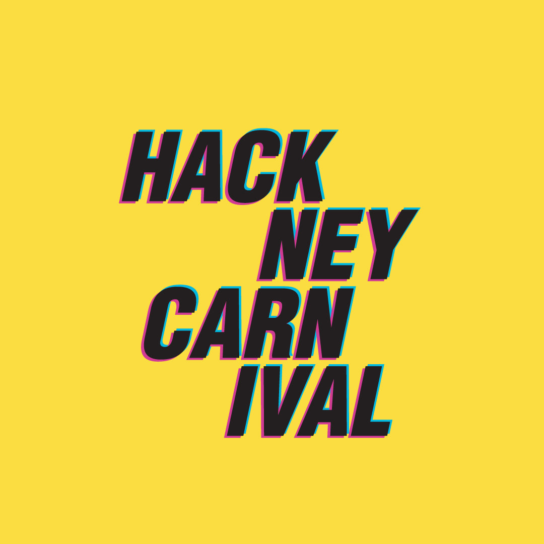
VISUAL LANGUAGE
An asymmetric logo block was created as part of the wider visual language, following the same slanted rhythm as the offset typography. This shape is used consistently across the campaign to create flow and cohesion. To maintain brand integrity, the logo is always applied in either black or white, in line with corporate guidelines.


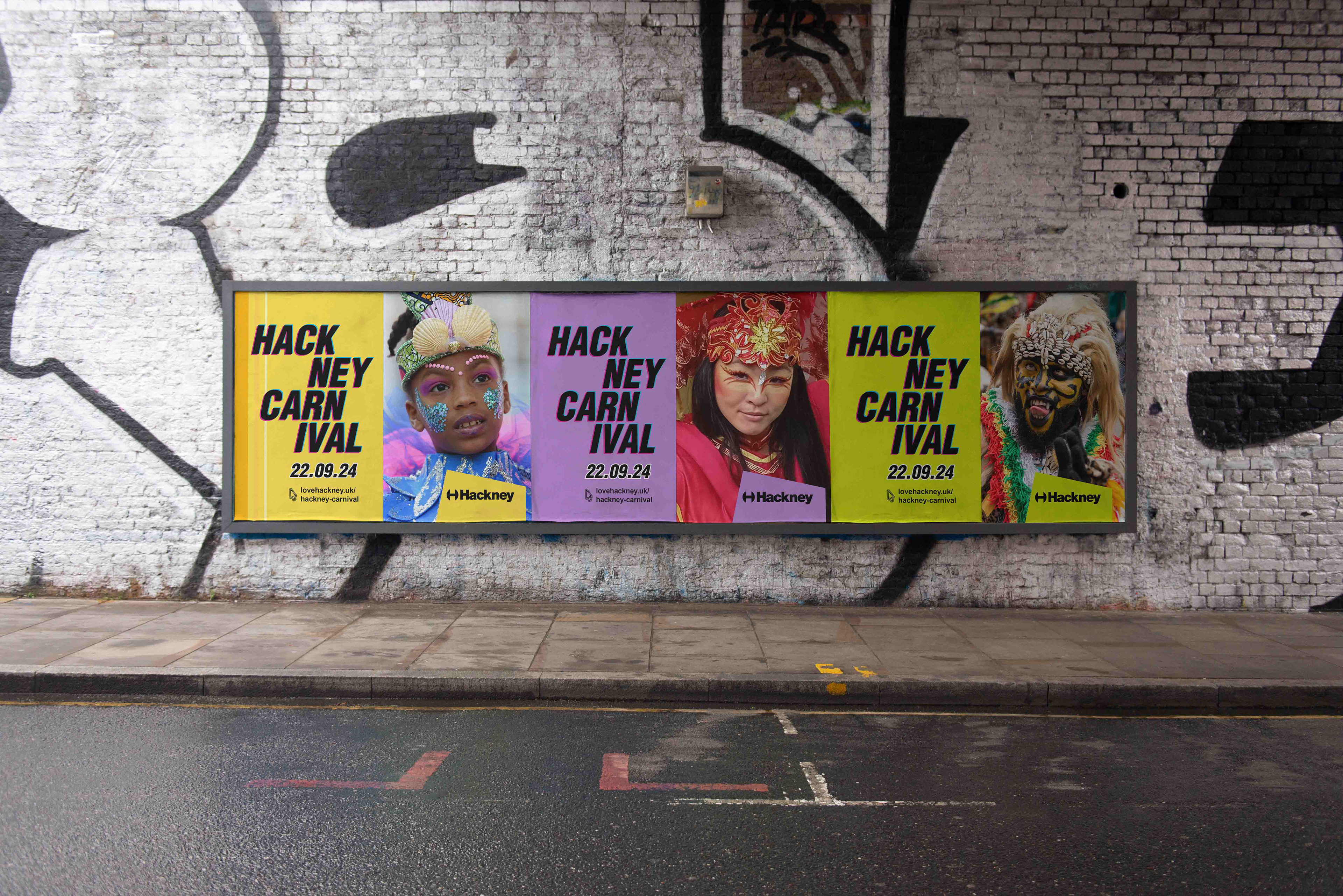
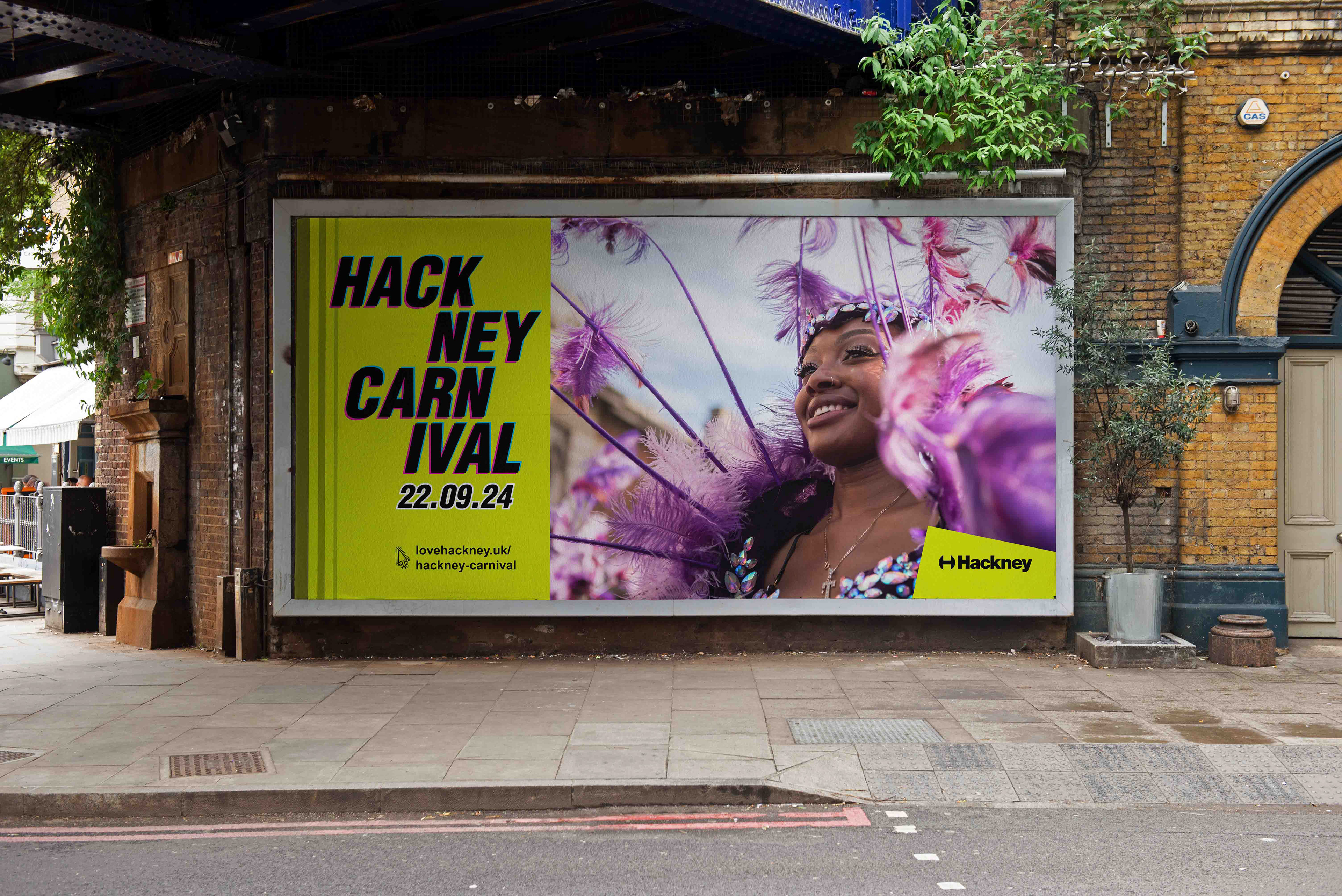
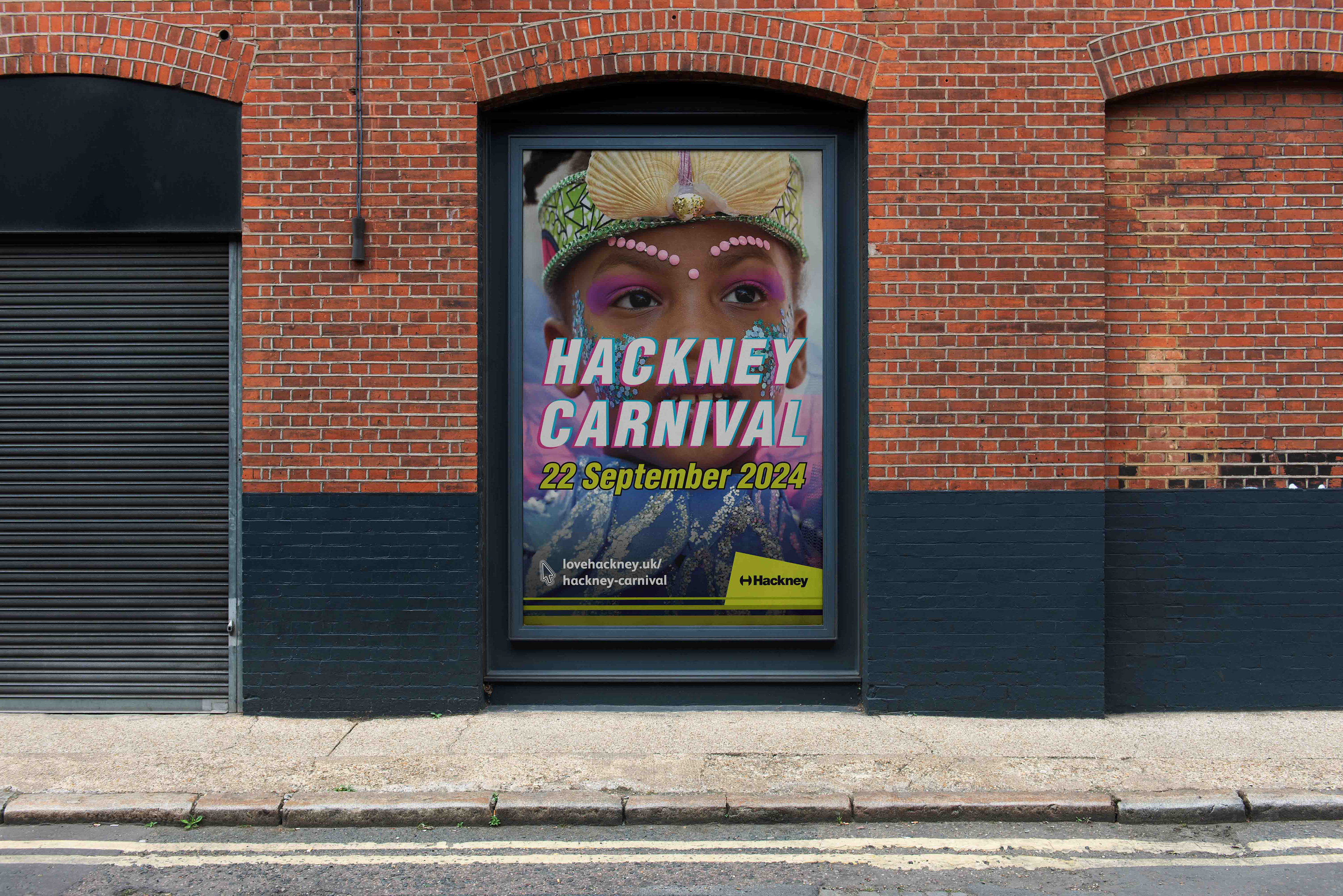
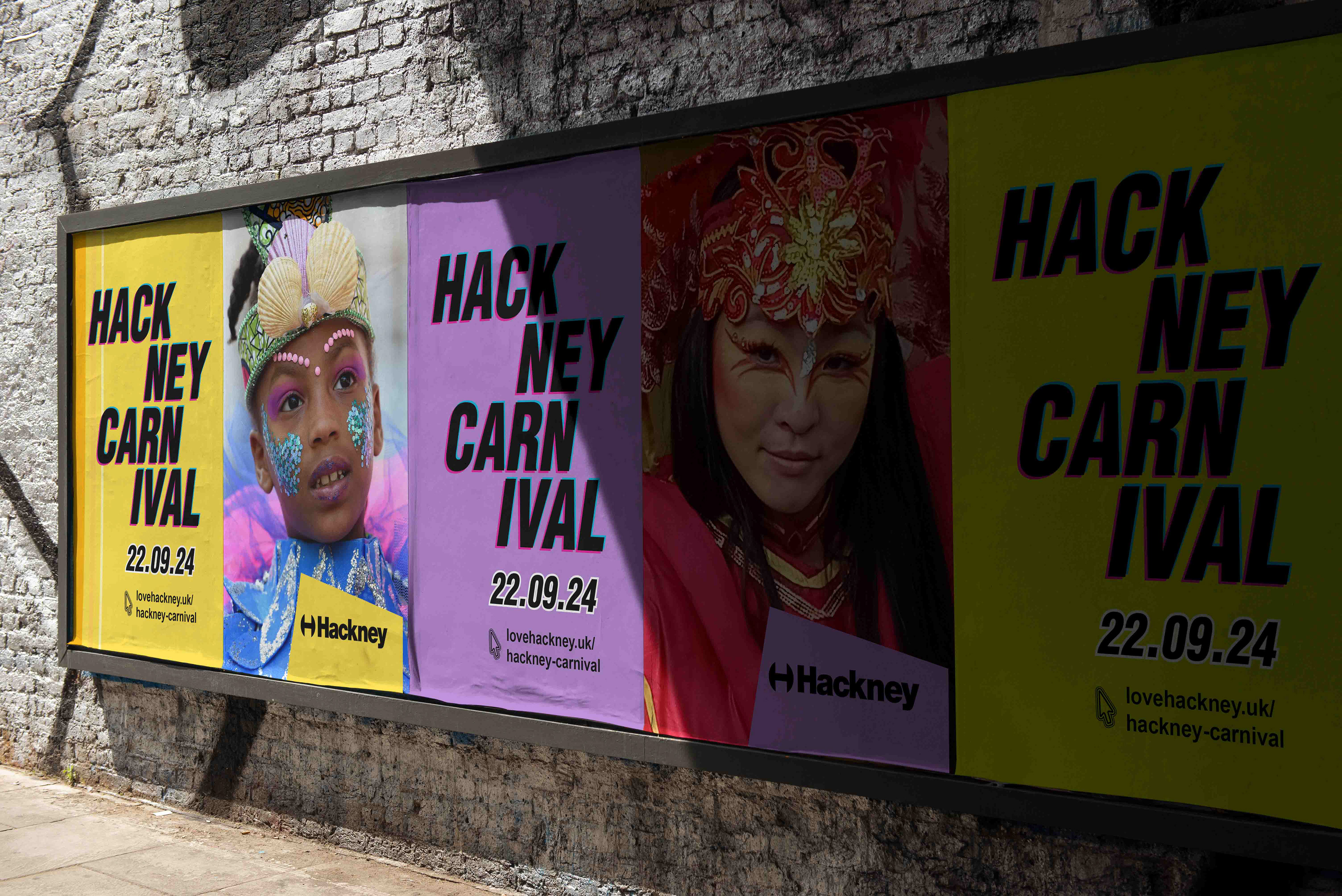
BILLBOARDS
The billboard designs feature photography from previous Hackney Carnivals, highlighting the culture and diversity of the borough. The use of colour brings energy to the streets, while the choice of real, recent imagery keeps the campaign grounded and authentic. The aim was to create a welcoming visual presence that reflects the shared, communal nature of the event.
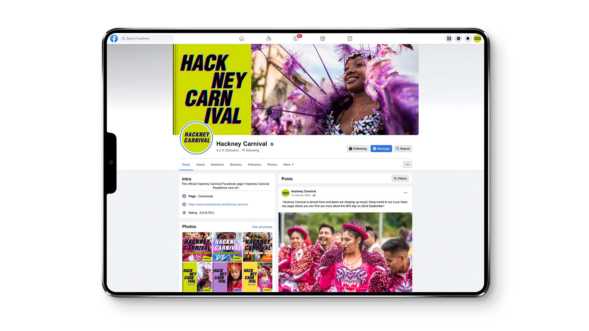
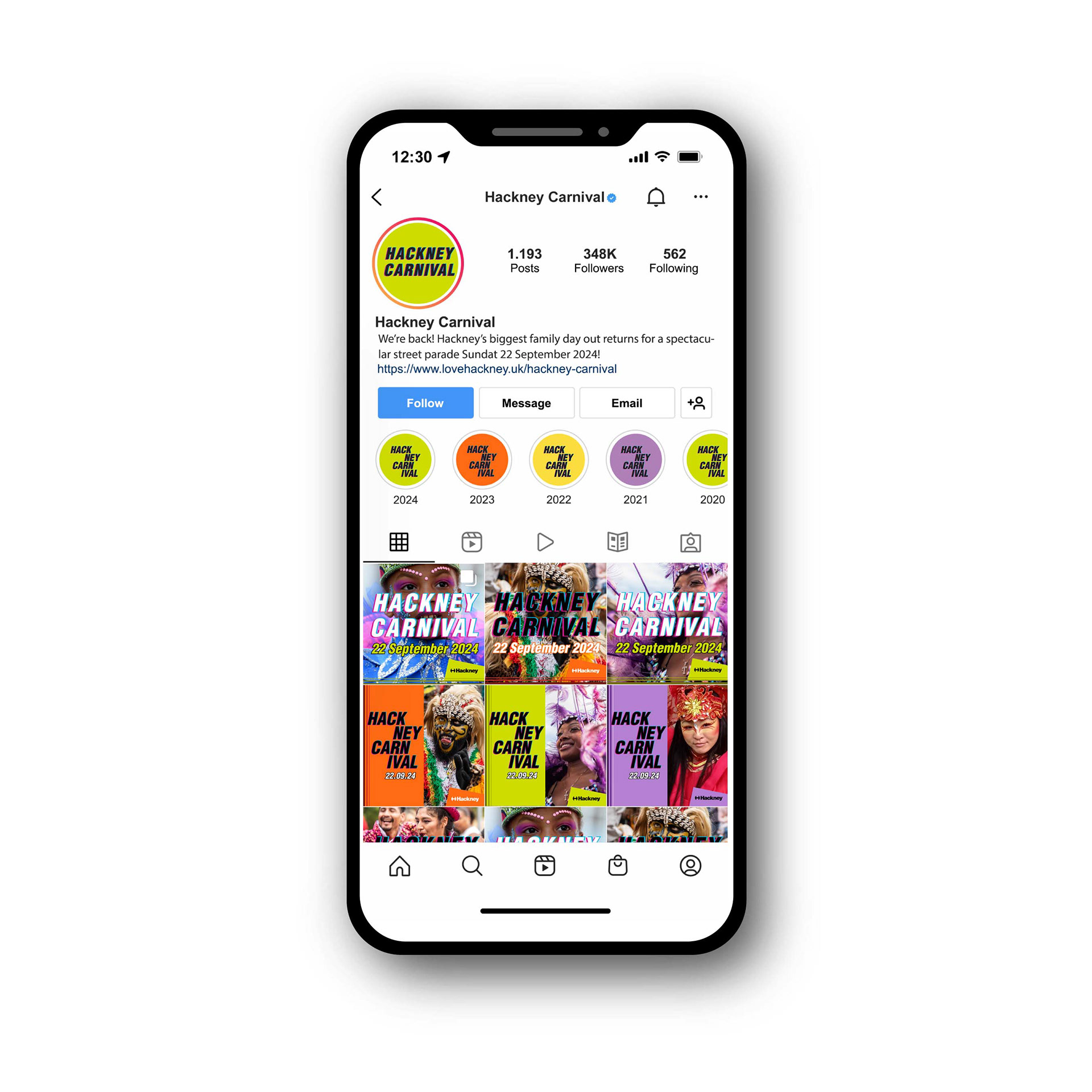
SOCIAL MEDIA
Social media assets were designed to complement the billboard visuals, using the same colour palette and graphic elements. The layouts are bold and playful, allowing the campaign to be instantly recognisable across platforms and easy to engage with.

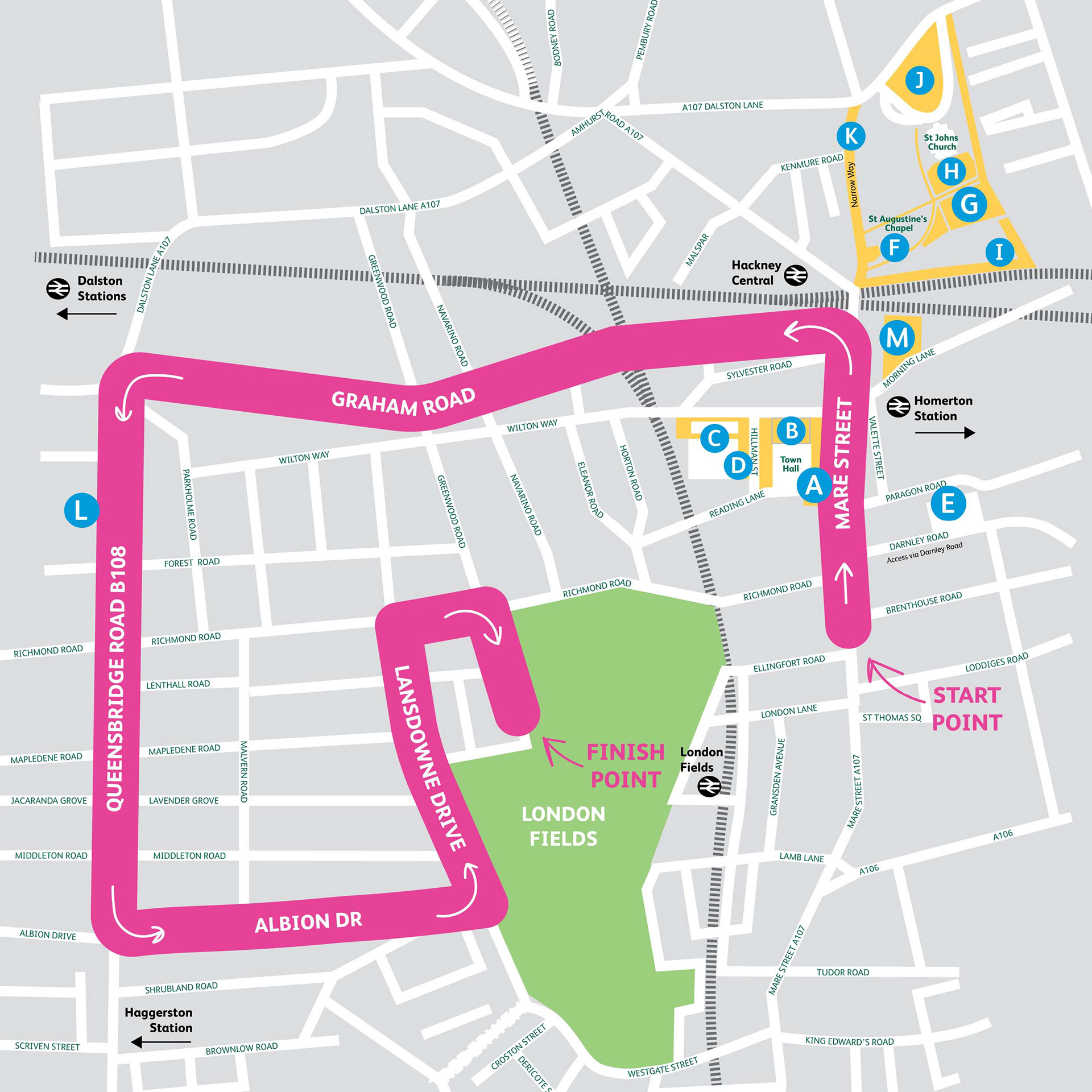
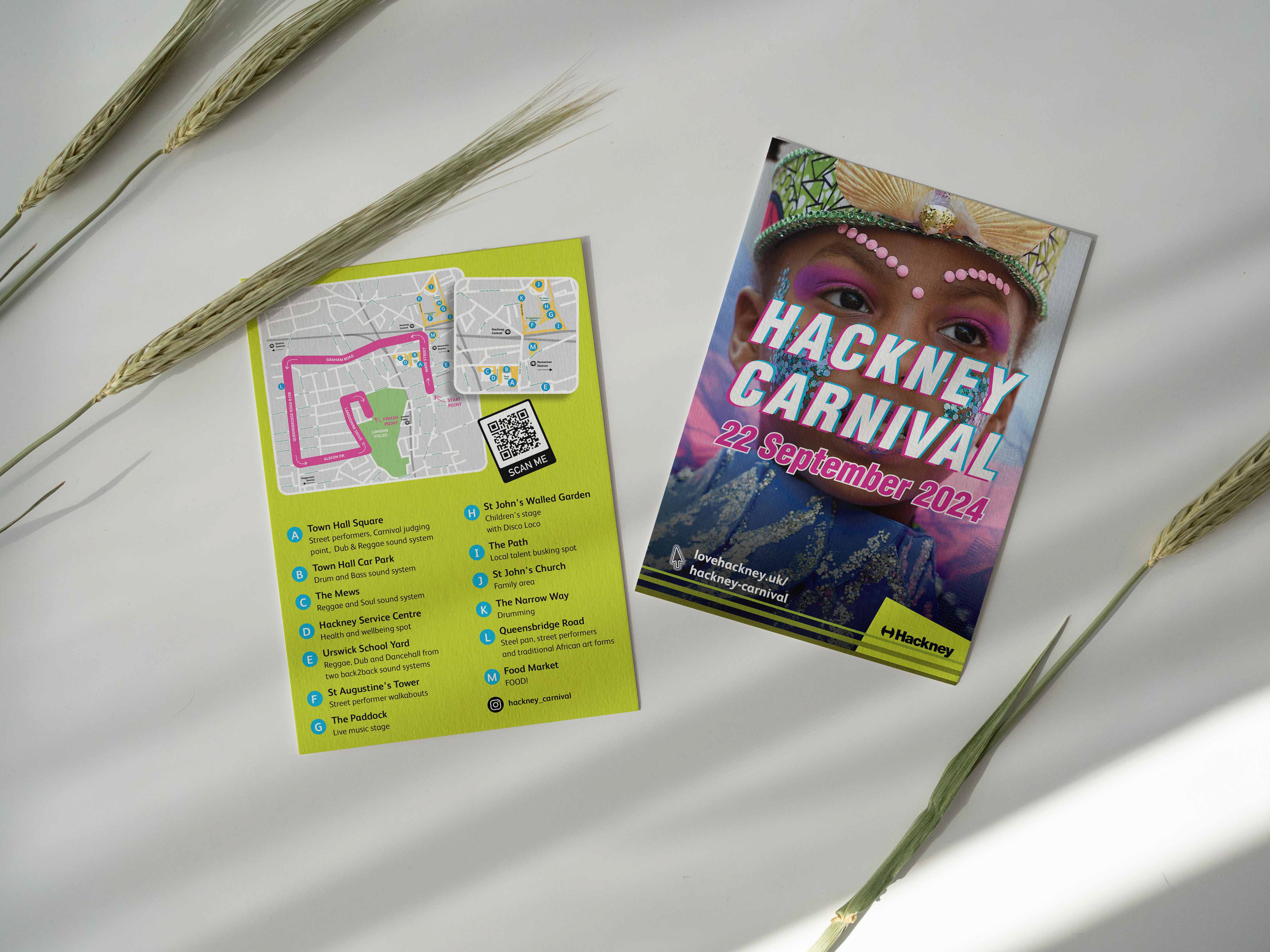
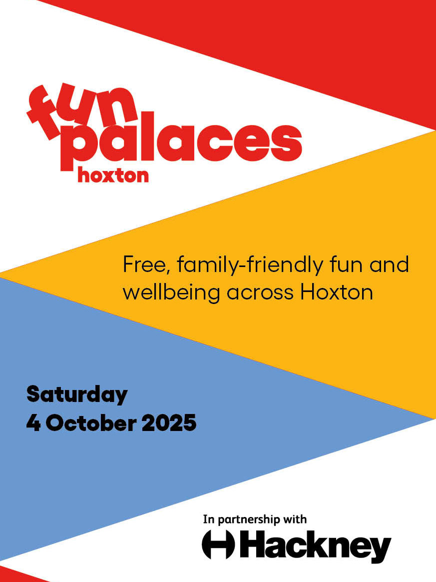
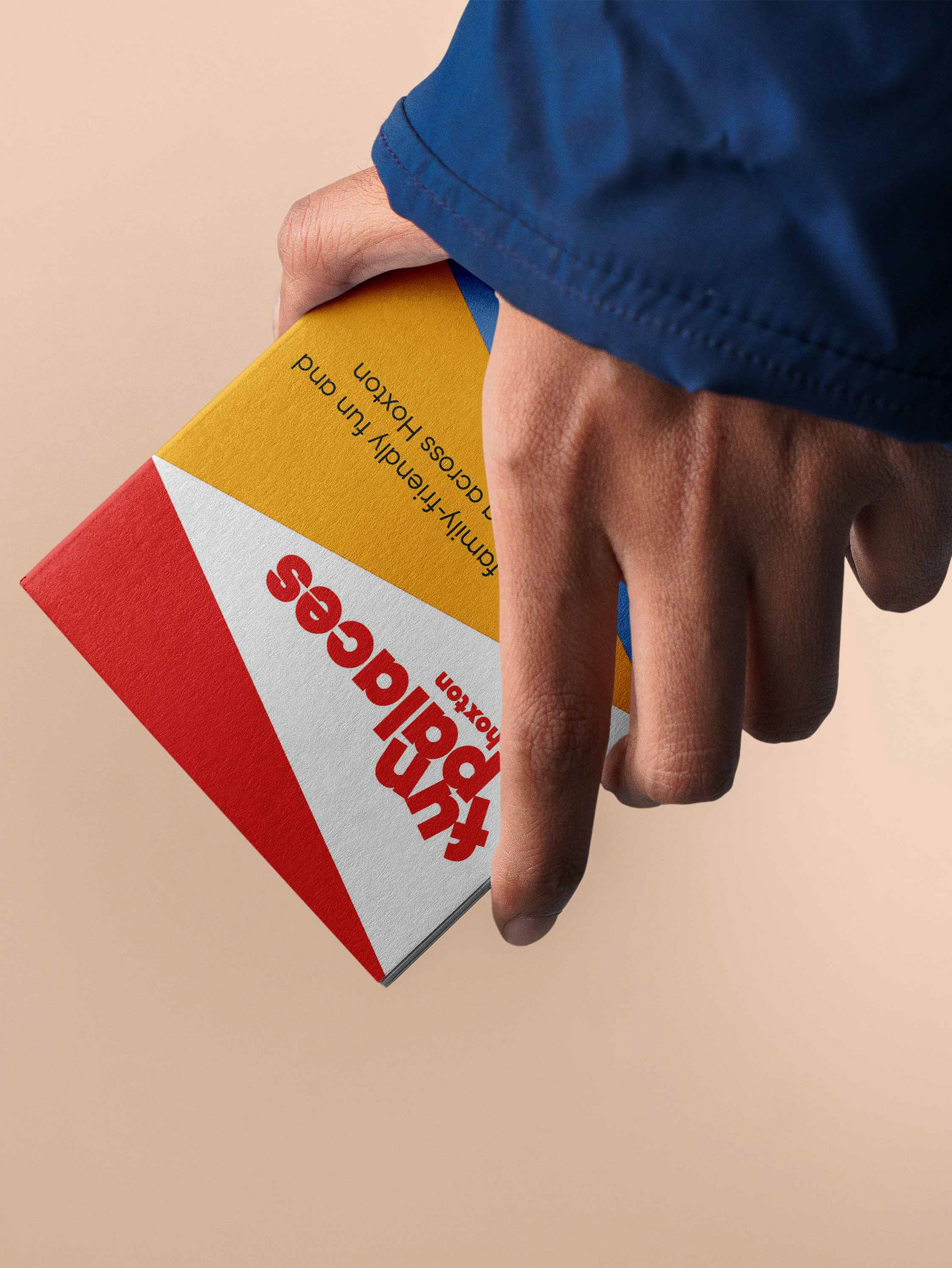
PROCESSION ROUTE MAP & STATIC SITES
An A5 printed leaflet was designed to communicate the Carnival procession route and key locations. A QR code directs users to the Hackney Carnival website, where they can find further information about static sites and the event schedule.