BRIEF
A campaign designed to engage and support parents, providing clear, accessible materials that highlight key resources and practical actions. The campaign aimed to make important information approachable and visually engaging while adhering to the council’s branding guidelines.
ASSETS
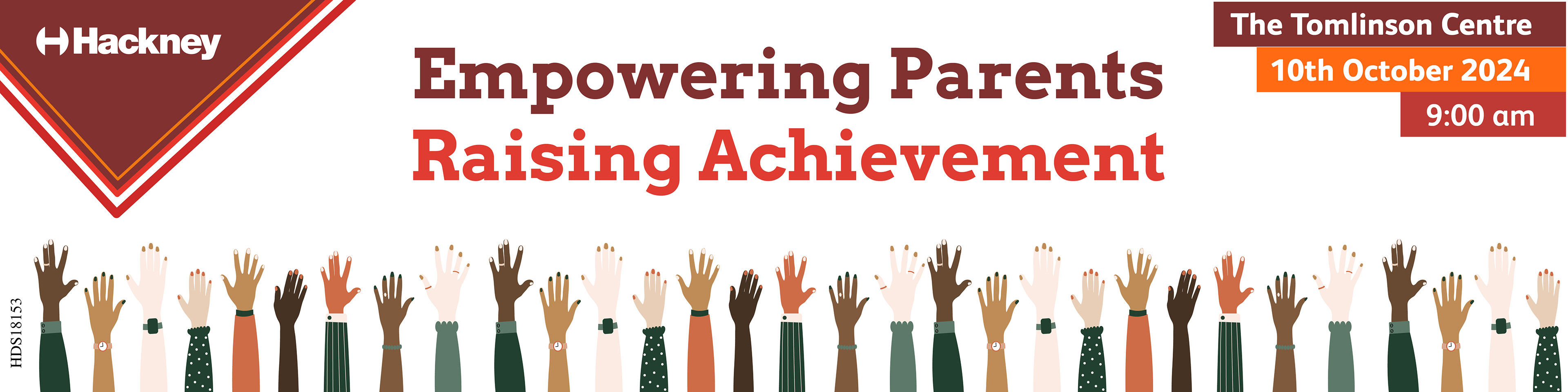
• Email banner
• A5 Double Sided Flyer
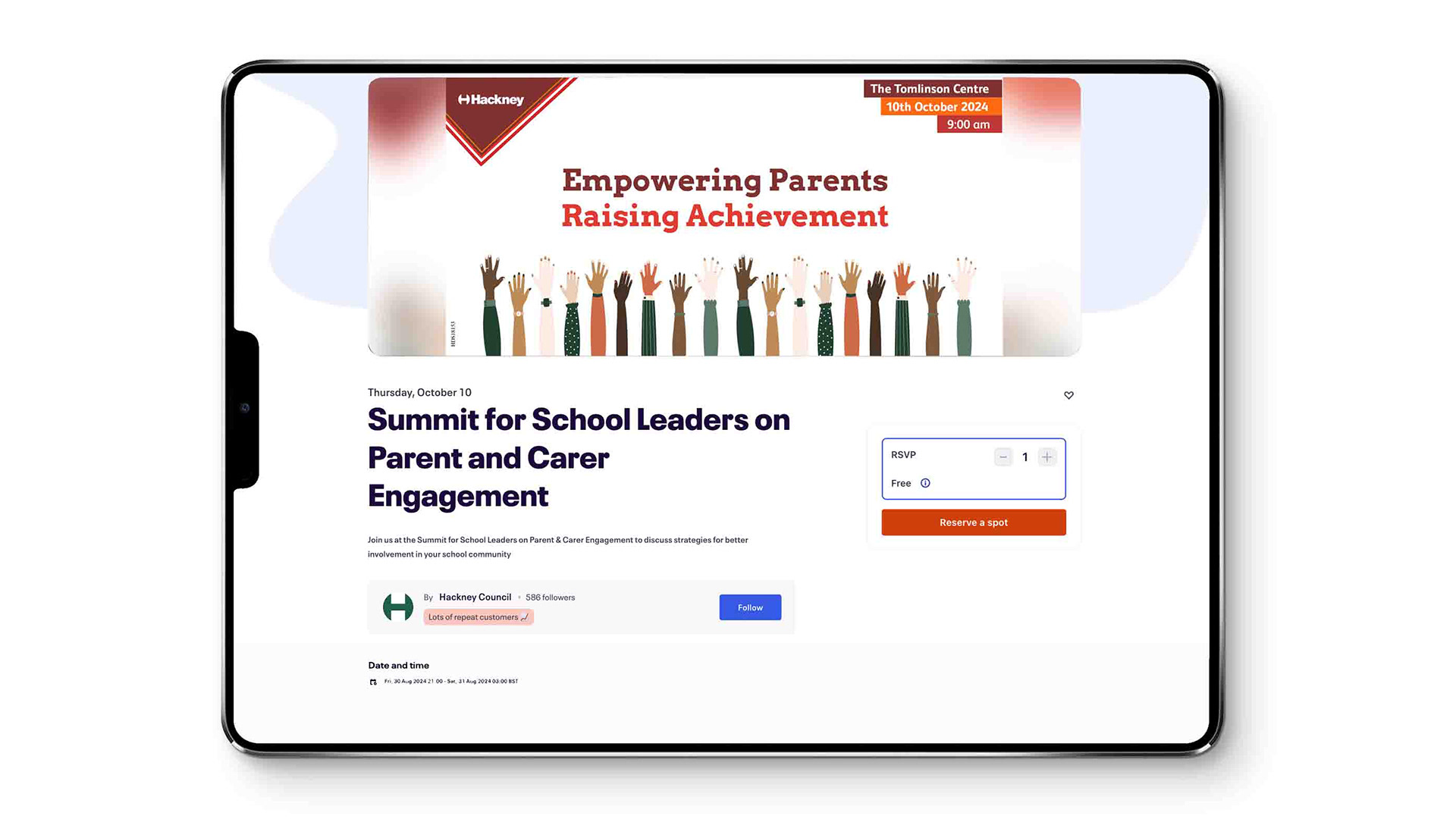
• EventBrite Banner
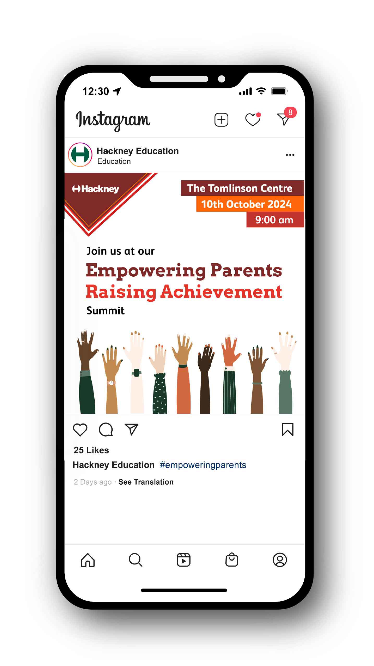
• Social Media Banner
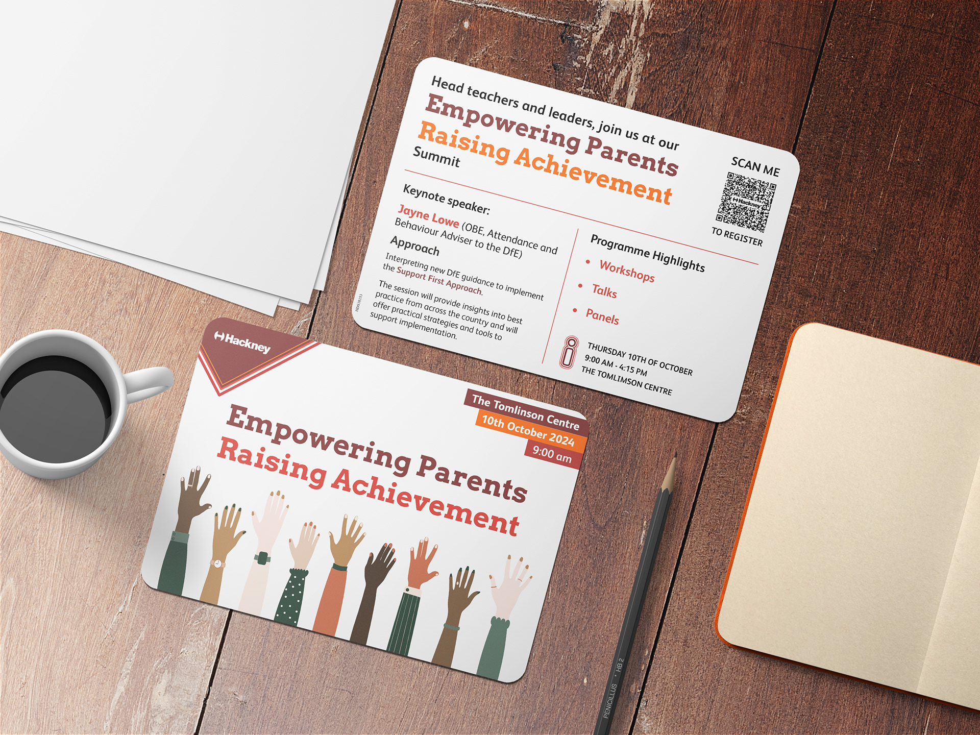
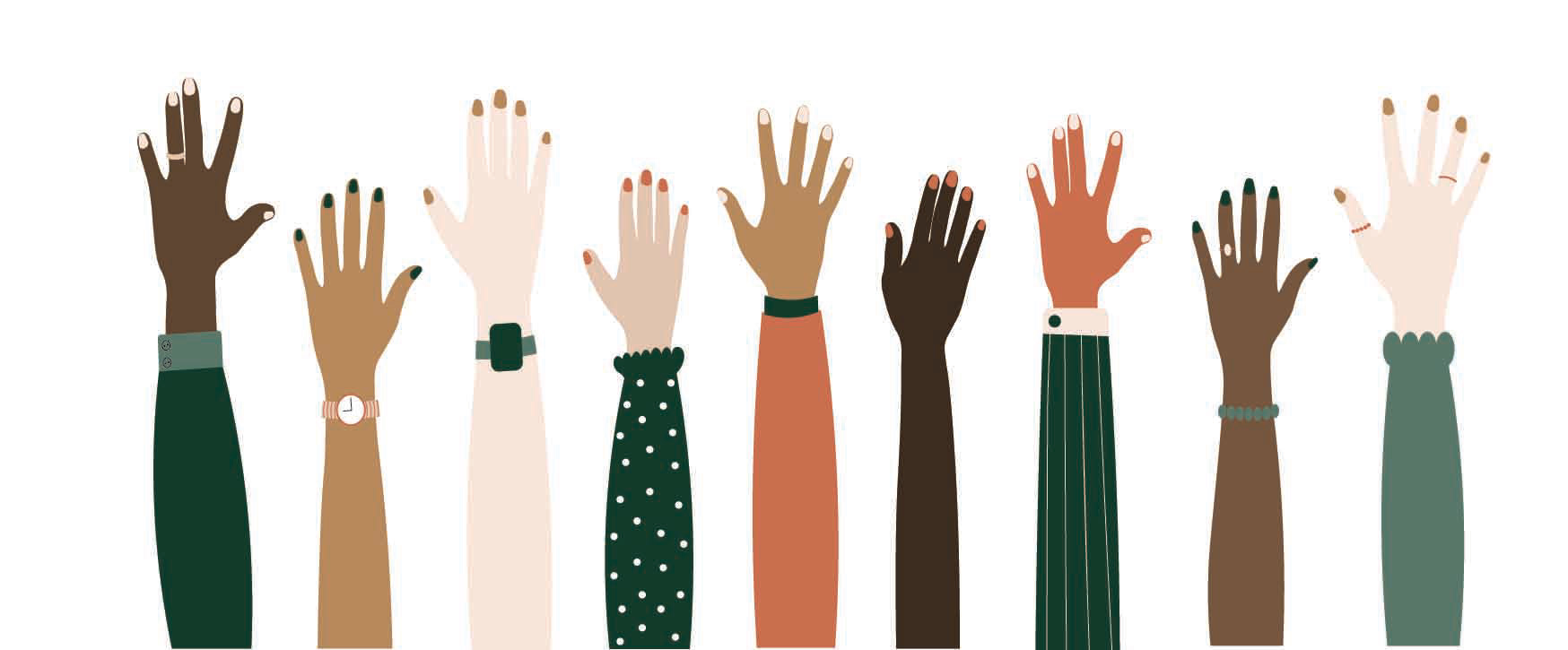
Visual Identity
The campaign uses a red-based colour palette in line with the council’s guidelines, with added vibrancy through bespoke illustrations. The illustration of raised hands symbolises parents’ willingness to engage, learn, and take action to better support their children’s development.
OUTCOME
The campaign successfully communicates important information in a visually accessible and approachable way, encouraging parental engagement and participation in local educational initiatives.